Skip to main content Skip to main navigation Skip to footer
Cases
RWU Ravensburg-Weingarten University

How a University Became a Brand

Falling enrollment, increasing competition, and an unclear public image: RWU had to reinvent itself—before it could rebrand itself.

Workshop setting with students
Many white sticky notes with notes on a workshop wall

Identity isn’t forged in a conference room

At first glance, the situation seemed familiar. Ravensburg-Weingarten University of Applied Sciences wanted to boost its appeal. But behind this task lay a greater challenge. Due to demographic shifts, there were fewer potential students. At the same time, universities are increasingly competing for the same target groups, particularly with institutions in metropolitan areas.

The question, therefore, was not: How do we design a new website?
But rather: How can a university remain visible and relevant in a shrinking education market?

The answer began with an extraordinary participatory process. Around 3,600 students, staff members, and professors contributed their perspectives to an open-space process that lasted several weeks. With the support of the university administration, a spirit of openness emerged that went far beyond traditional branding projects. It quickly became clear that the university was strong internally. Externally, however, a clear image was lacking: the institution was referred to by different names, its strengths were communicated inconsistently, and—especially for international target groups—the university remained difficult to grasp.

The process led to a key insight: it wasn’t the website that needed to be reimagined first, but the university’s identity. It was the identity.

Our mission as a university is to educate young people to think independently and creatively. This enables them to develop their talents and make a positive contribution to our society.
Professor Dr. Thomas Spägele
President of RWU

A brand that can be pronounced

The new brand was designed to fulfill several purposes at once. It had to provide guidance, be effective internationally, convey institutional credibility, and at the same time preserve its regional roots.

These requirements gave rise to the acronym RWU. It is concise, easy to pronounce, and works regardless of language or origin. At the same time, it sets the university apart from generic designations and creates a distinct identity.

The name thus became not merely a design detail, but a strategic tool for brand development.

The Lion as a Cultural Anchor

While RWU looks outward, the university’s symbol connects it to its origins. The symbol references the region’s history and conveys qualities that are also intended to shape the brand: strength, self-confidence, and direction.

The combination of an internationally recognizable acronym and regionally rooted symbolism creates a balance that many universities strive for: global connectivity without losing their own identity.

For this successful fusion of strategy and design, the project was honored with the German Design Award in 2020.

Information sign on a green space; on the right, a purple arrow symbol inside a circle
A person outdoors on the grass, holding a white cloth bag with "RWU" written on it
Style Guide Overview with Various Diagrams, Graphics, and Data Elements
A large house icon and many small icons on the right side
Preview of a multi-column magazine layout featuring photographs, text, and purple accent colors
Three purple posters featuring portraits and the RWU logo

The Digital Platform for University Communications

Following an intensive preparatory phase, development of the new digital platform began.

The challenge lay not so much in transferring existing content to a new system, but rather in consistently aligning the university’s communications with the needs of its target audiences. The information architecture, content strategy and user journeys were developed collaboratively. Much of the existing content was deliberately not migrated, but instead fundamentally revised.

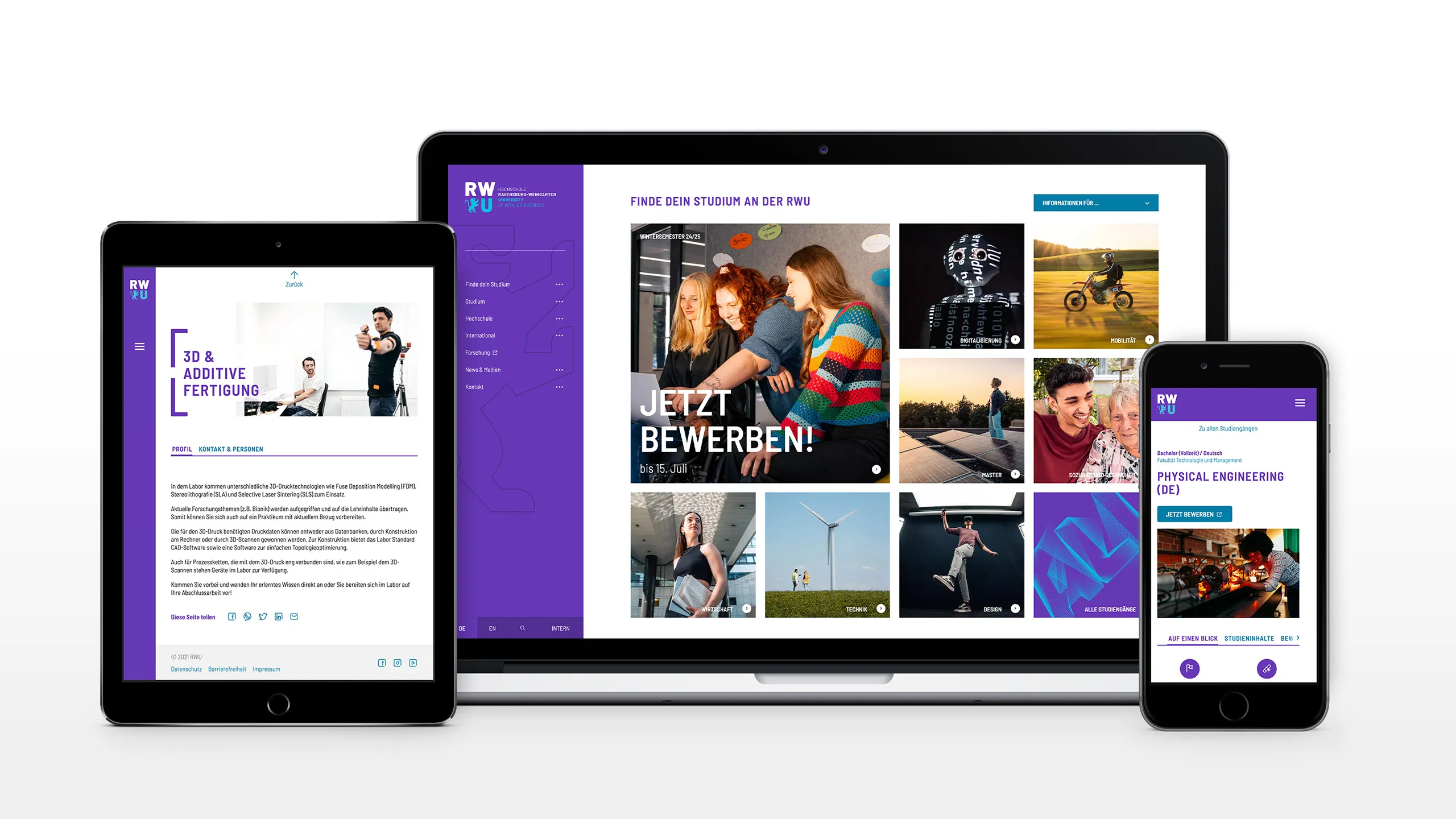
The result is a modular platform based on Drupal, which caters equally to prospective students, researchers, businesses, staff and international audiences. Individual content types and flexible building blocks ensure consistent user guidance and support editorial teams in creating structured content.

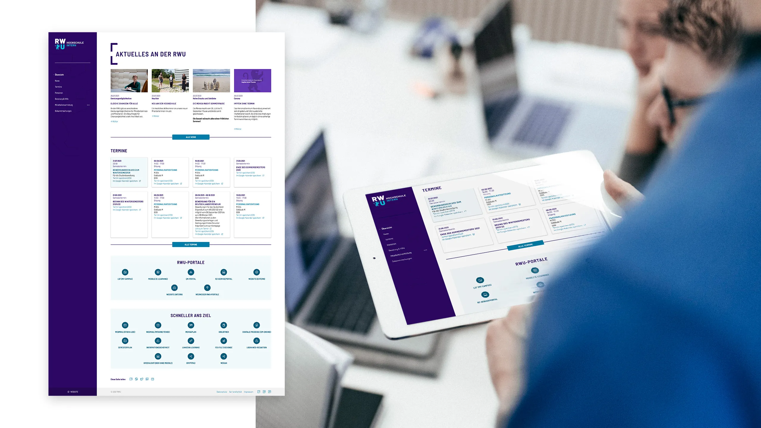
Right from the design stage, the platform was set up as a Drupal multisite architecture. Alongside the central university website, the internal section, independent research websites and the Student Union’s website were created on the same technical basis. Shared components ensure a consistent look and feel, whilst the individual sections can operate editorially independently.

The platform continues to be developed to this day and is now based on Drupal 11. It meets high standards of security and accessibility and is designed for an organisation with more than 40 editors, the composition of which changes regularly. Clear content governance and the reusable component architecture ensure that new content can be created quickly and that the platform remains understandable, robust and maintainable in the long term.

Various devices display a responsive website on tablets, laptops, and smartphones.
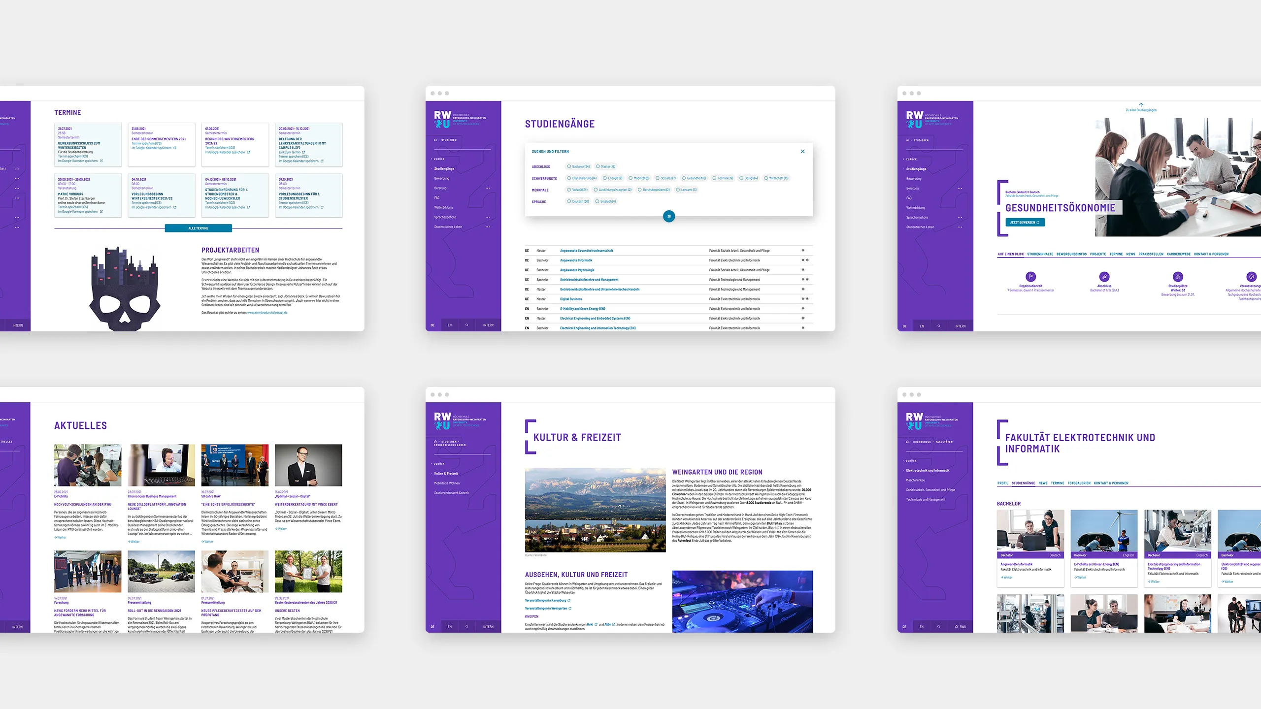
Thumbnails of various screens and layouts

More Than Just a Relaunch

As part of the project, a new corporate design, a new brand, and a new website were developed.

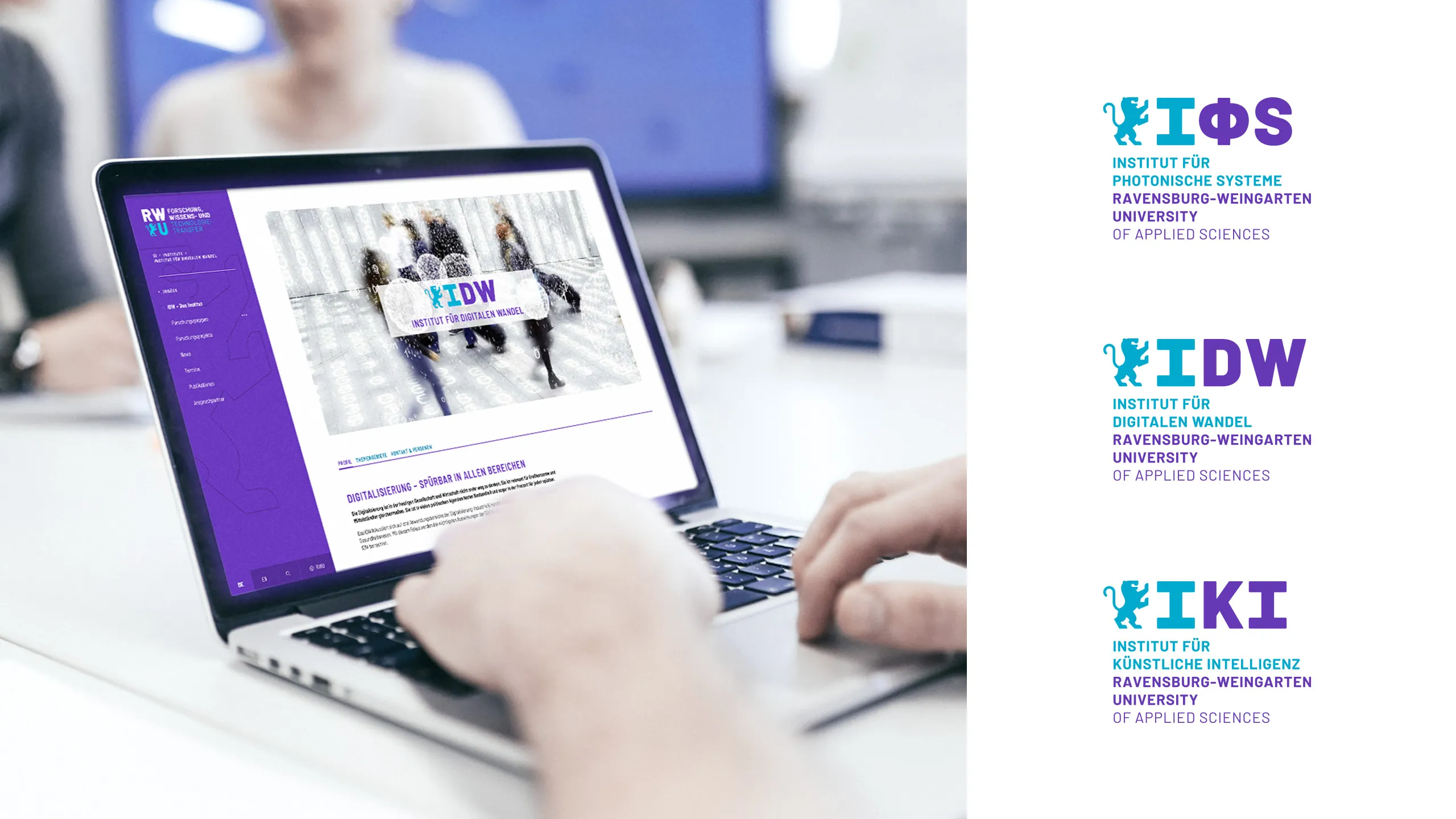
The roles of the academic departments were also redefined. The research institutions gained greater visibility, internal communication channels were restructured, and the university’s digital presence was systematically developed in line with its strategic goals.

Thus, what began as a website relaunch evolved into a comprehensive transformation that integrates brand development, university marketing, university communications, and the digital platform.

A person at a desk with a laptop. On the left, a view of the internal section of the RWU website in the foreground
A person is typing on a laptop displaying a research website. On the right are various institute logos.

The Result

The biggest change cannot be measured by key figures alone.

RWU has significantly increased its visibility and fostered a stronger sense of identification among students, staff, and partners. The new brand became the unifying element of a university that sought to position itself more clearly and present itself more internationally.

To this day, brand strategy, corporate design, and the digital platform form the foundation for the university’s ongoing development. Not because the design came first, but because the university first understood who it wanted to be.

Our identity as a practice-oriented and internationally focused educational institution is reflected in the opportunities we offer our employees. Whether in teaching, research, or academic support functions, RWU is a place of diversity and dynamism.
Henning Rudewig
Chancellor of RWU