Skip to main content Skip to main navigation Skip to footer
Cases
Potsdam University of Applied Sciences

Room for creativity in turbulent times

Sometimes everything changes during a project. That’s exactly what happened at the Potsdam University of Applied Sciences. What began as a traditional website relaunch evolved into an entirely new workflow in the midst of the first COVID-19 lockdown. Instead of relying on rigid concepts, a digital platform was created step by step that could respond flexibly to changes—and continues to grow alongside the university to this day.

Unusual times call for different approaches

The task was actually clearly defined. The existing website was outdated both technically and in terms of design and no longer did justice to the Potsdam University of Applied Sciences as a modern institution of higher education. The content needed to be restructured, processes simplified, and the digital presence consistently aligned with accessibility, search engine optimization, and the needs of the various target groups.

Then came the first COVID-19 lockdown.

Workshops, on-site collaboration, and traditional project workflows were suddenly no longer possible. At the same time, requirements were changing almost daily. Priorities shifted, new communication channels emerged, and many decisions had to be made on short notice.

Instead of sticking to the originally planned schedule, we reimagined the entire process. Analysis, information architecture, prototyping, and development all ran in parallel. Decisions were made wherever they made the most sense at the time. Step by step, this resulted not only in a new website but also in a project that evolved alongside the changing requirements.
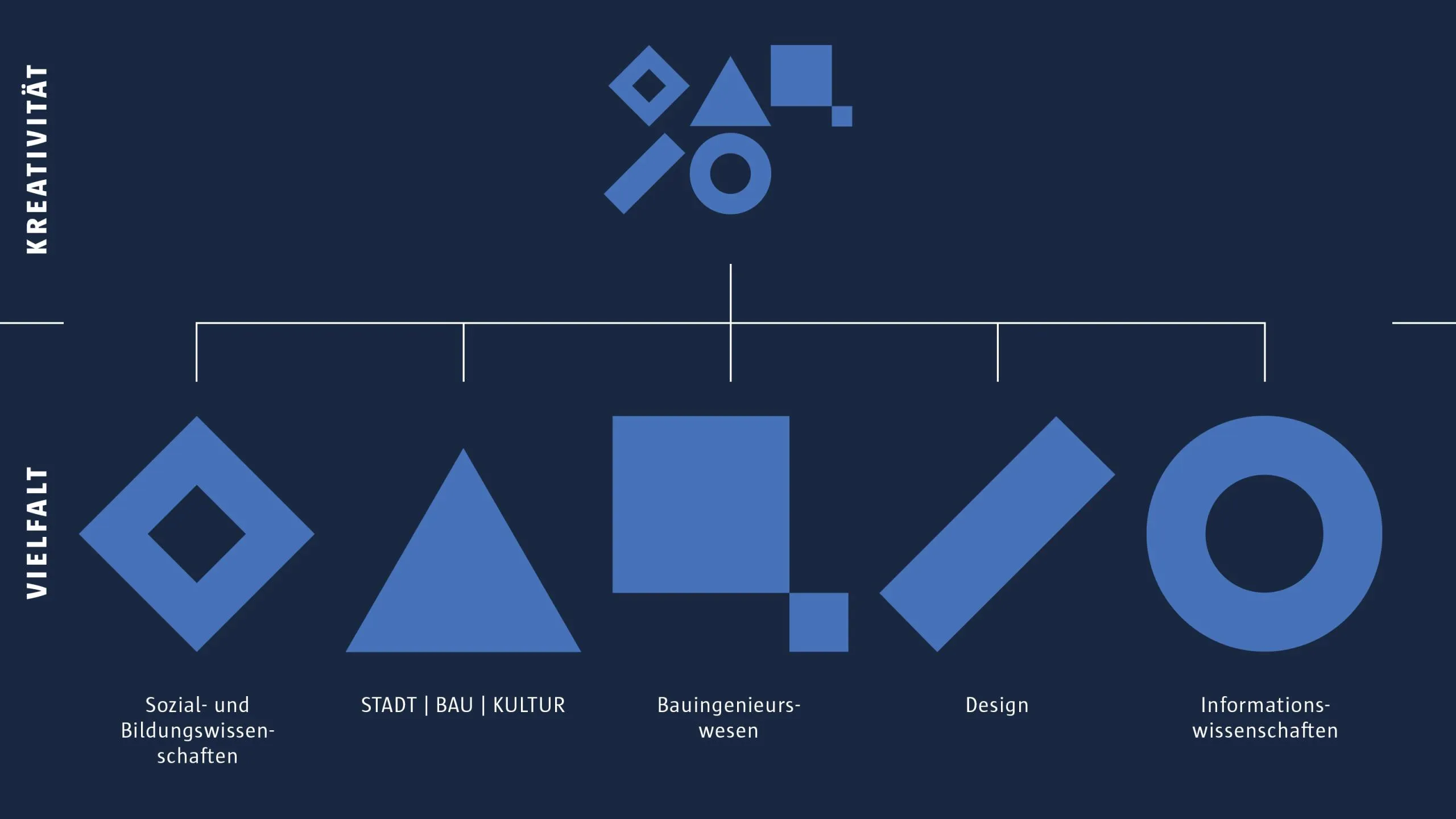
The diagram shows geometric shapes in blue: a diamond, a triangle, a square, a checkmark, and a circle

Get involved early. Grow together.

A system only realizes its full value when people start using it.

That’s why we involved university communications and the editorial team early in the development process. While the platform was being built, content could already be revised, organizational structures refined, and initial experience gained. Feedback was immediately incorporated into further development.

The result was far more than just a technical implementation. Content became more consistent, editorial processes more efficient, and employees were able to focus more on their professional tasks instead of dealing with technical hurdles.

Despite the extraordinary circumstances, the new website was launched almost exactly on schedule.

Flexible for many. Consistent for all.

University websites are among the most complex digital platforms of all. Academic departments, degree programs, research teams, support services, and administration each pursue different goals and address different target audiences.

The challenge, therefore, is not to create as much freedom as possible, but to find exactly the right balance between individuality and consistency.

Based on Drupal, a modular system consisting of content types, components, and central building blocks was developed. Academic departments can design their content flexibly without losing sight of the university’s overall image. Intelligent links, taxonomies, and reusable content reduce editorial effort and prevent duplicate maintenance.

Another logical step was the merger of the public website and the intranet. After logging in, the platform expands to include internal information without requiring users to switch between different systems. One website—tailored to the respective context of use.

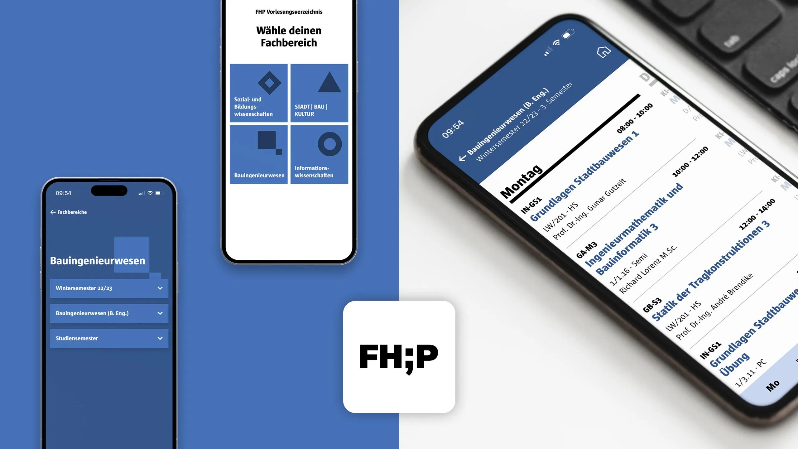
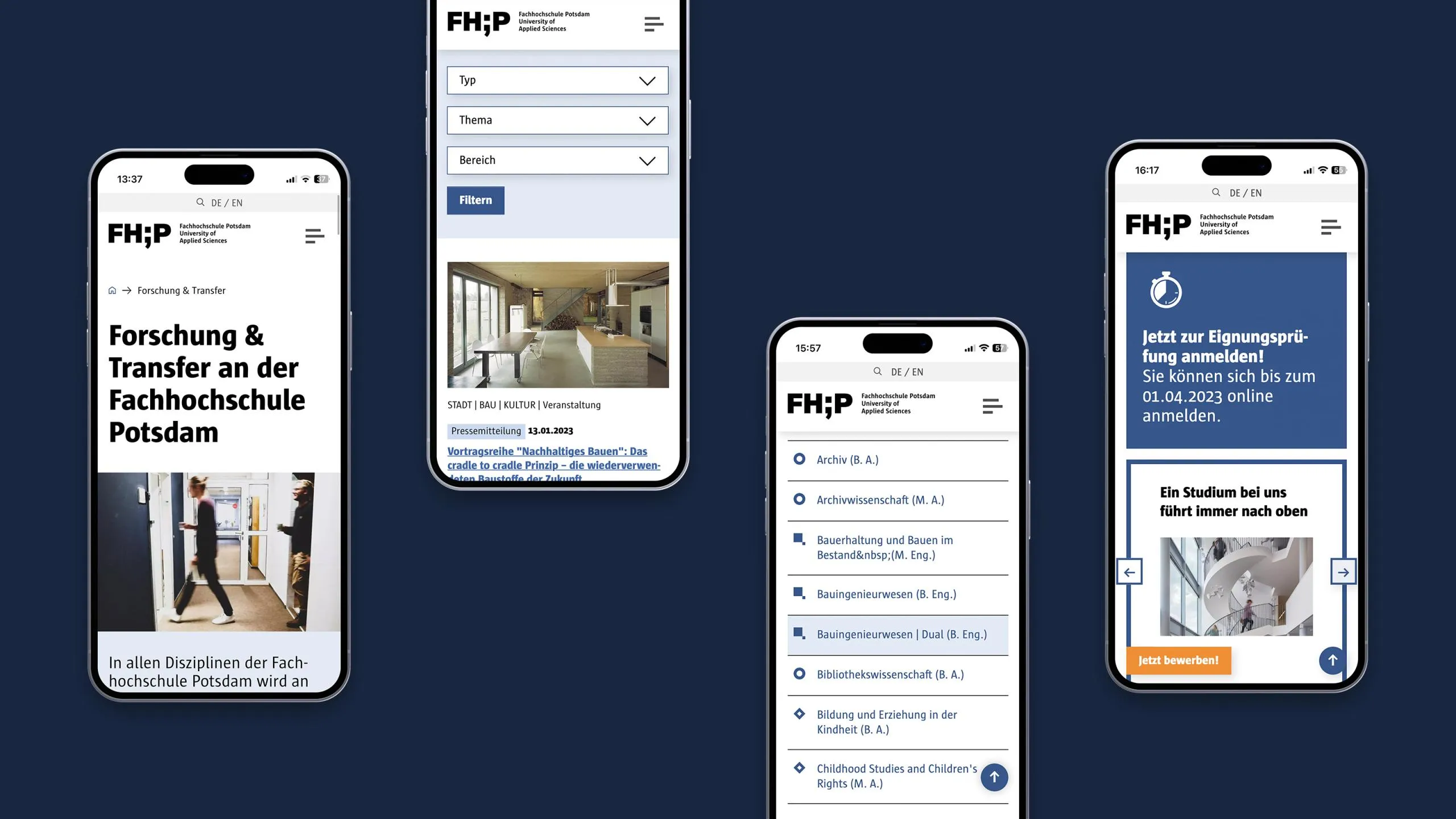
Four smartphone screens display different views of a mobile website against a dark blue background.
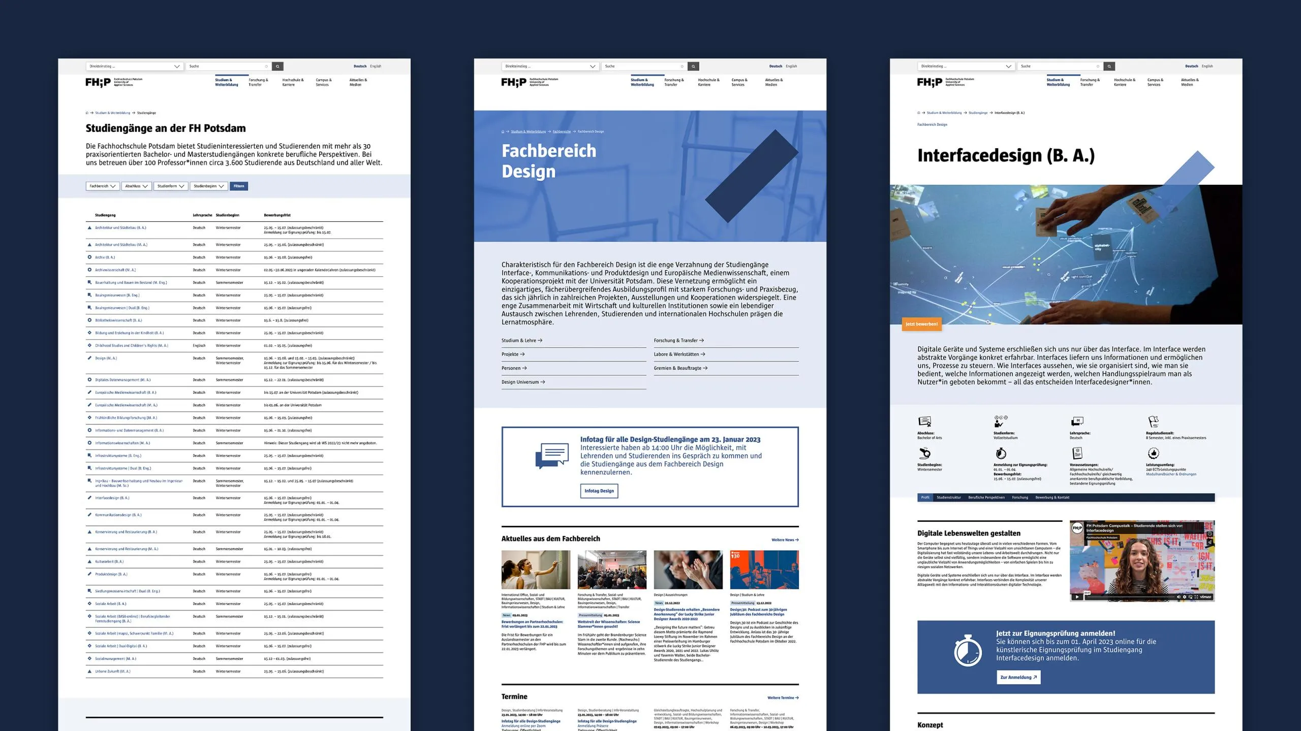
Three screenshots of web pages containing tables and images

Not every solution is a website

During the design phase, one area stood out in particular: the course catalog.

Of course, the course schedule could still be displayed on the website. The real question, however, was: Is that really the best solution?

Students need access to their course schedules on the go—quickly, easily, and without lengthy navigation. This insight led to the creation of a Progressive Web App. No installation required, no App Store needed—it runs directly in the browser and can be saved to the smartphone’s home screen with just a few clicks.

A small idea with a big impact, because it was consistently designed with the students’ usage scenarios in mind.

Various smartphones display parts of the FHP app within the application

Digital doesn't end at the screen

The relaunch didn’t just result in a new website. The digital identity became the foundation for the further development of the university’s entire communications strategy.

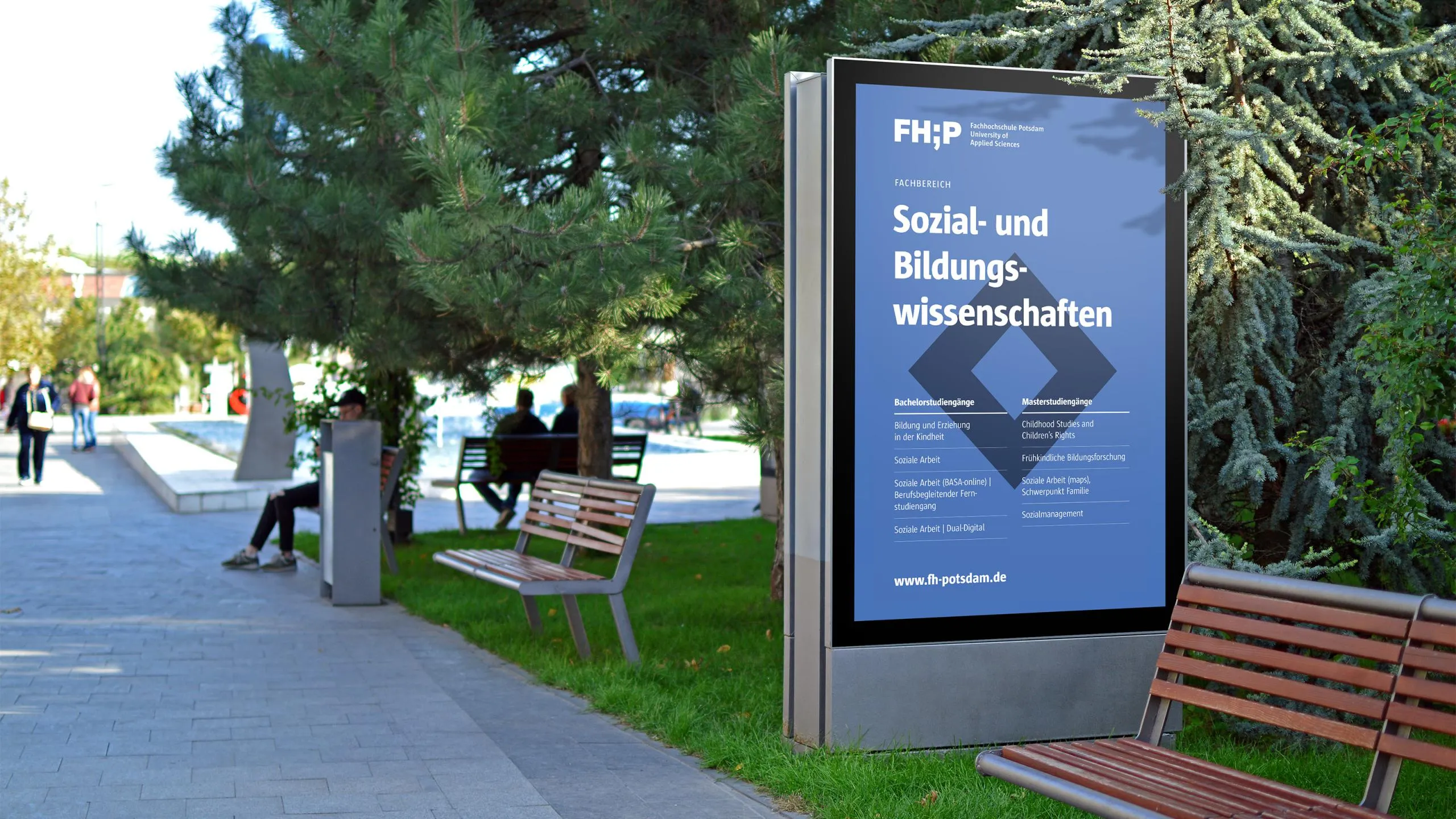
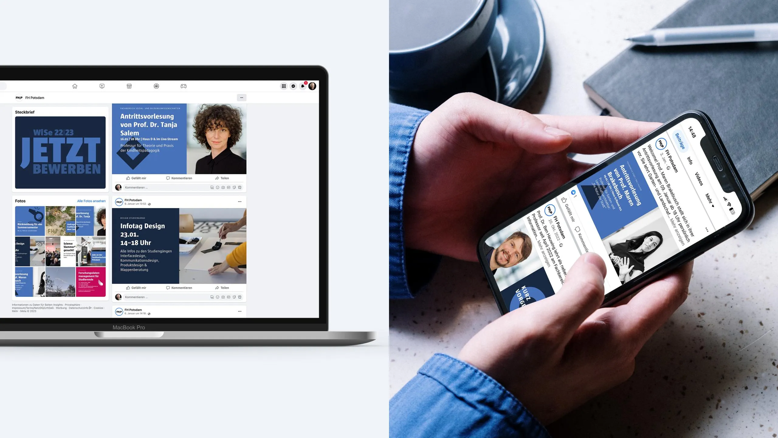
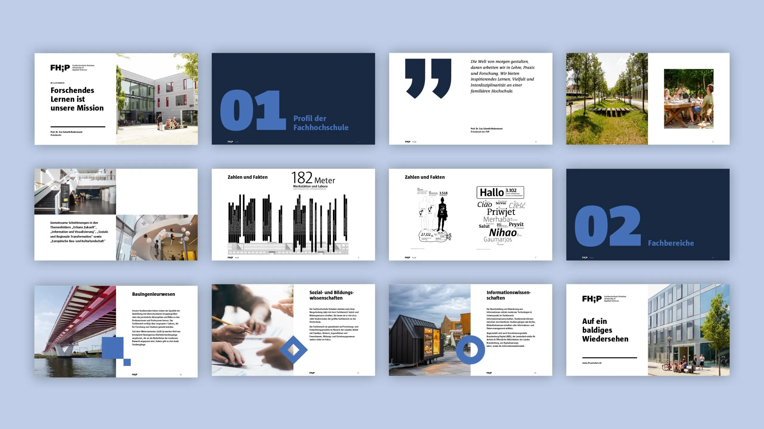
Subsequently, print media, social media templates, presentations, and other communication tools were gradually adapted to the new design. In this way, what began as a website project evolved into a consistent digital foundation for the entire Potsdam University of Applied Sciences brand.

A display on a street next to a bench, with trees in the background
Laptops and tablets display digital content on social media
Overview of several presentation slides featuring topics, graphics, and images