A website designed to adapt to change
When it came to the digital presence, one thing was clear: the website shouldn’t just work at the time of launch. It had to be able to grow alongside CSMM – with new projects, topics, locations and requirements.
That is why it was designed as a flexible system from the outset. Using Drupal as a basis, a technical and editorial structure was created that can be further developed without having to be completely rethought every time a change is made.
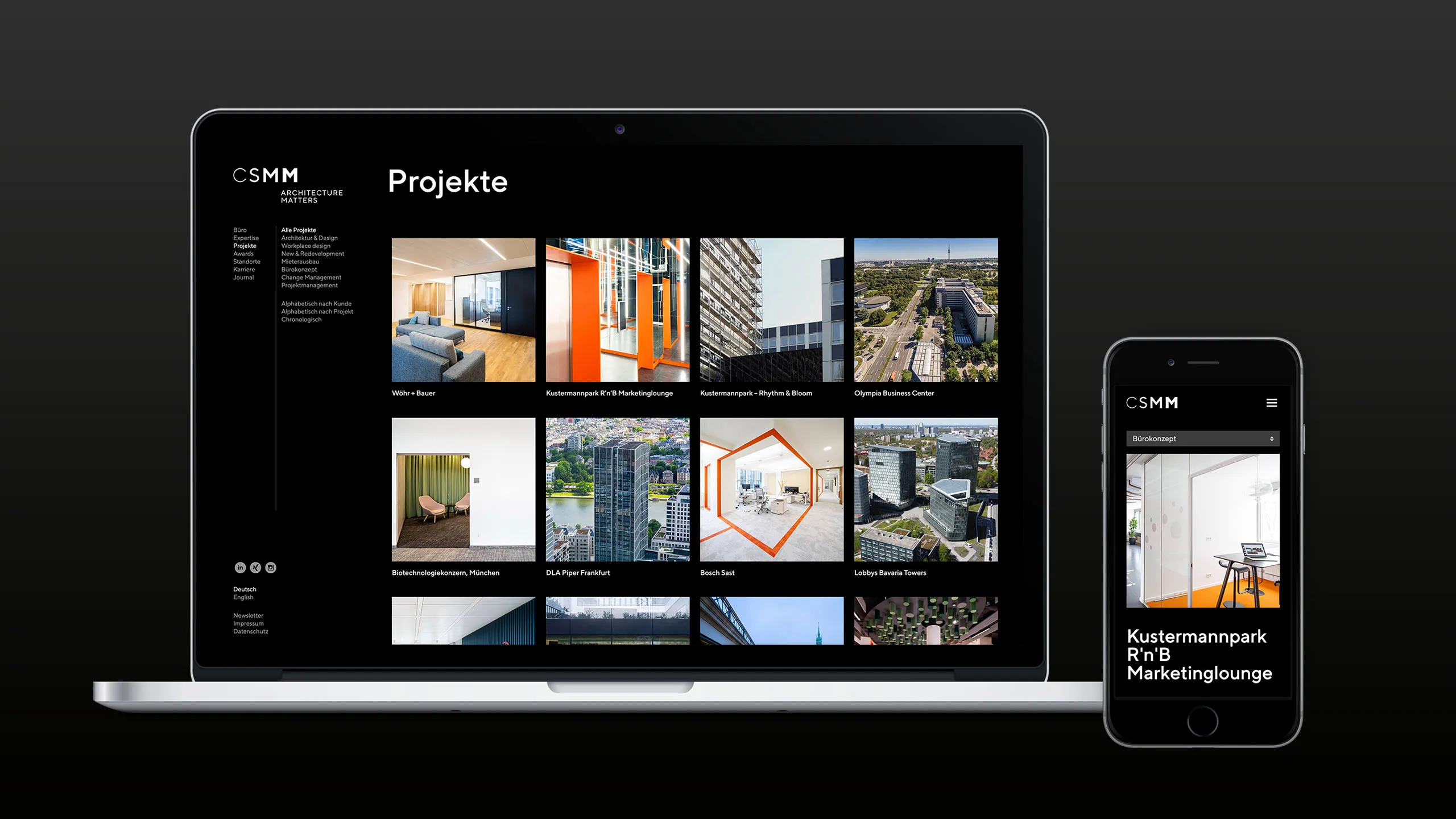
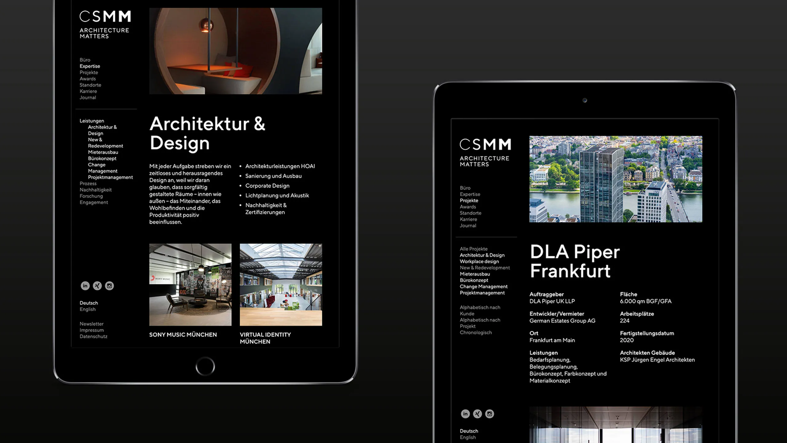
In terms of design, the website follows the same principle. A clear grid creates structure without appearing static. Projects, positions and topics take centre stage, whilst the design deliberately takes a back seat.
The Journal expands on this concept. CSMM uses the website not only to showcase projects, but also to share knowledge and take a stance on current issues relating to architecture, the workplace and property.