Skip to main content Skip to main navigation Skip to footer
Cases
Avantgarde PMC

Performance starts with people

Performance marketing is often explained in terms of numbers. Clicks, conversion rates, and funnels dominate the conversation. But it’s easy to lose sight of what it’s really all about: people. Every campaign starts with a target audience, and every touchpoint begins with a single decision. It was precisely this idea that served as the starting point for the development of the Avantgarde PMC brand.

A brand for an independent specialist

With the founding of Avantgarde PMC, a company was established within the Avantgarde Group that focuses entirely on performance marketing. The connection to the parent brand needed to remain visible, yet the company also required an identity that could stand on its own. 

That’s why we didn’t just create a new corporate design; we developed a brand with a clear and distinct identity. The name alone makes this ambition clear. While the legal company name emphasises the connection to the corporate group, the PMC brand is all about Performance. Media. Consulting. places the focus on the company’s professional specialisation.

An idea that runs through the entire brand

The focus of the brand development was not the traditional marketing funnel, but rather what defines it: the people who move through it.

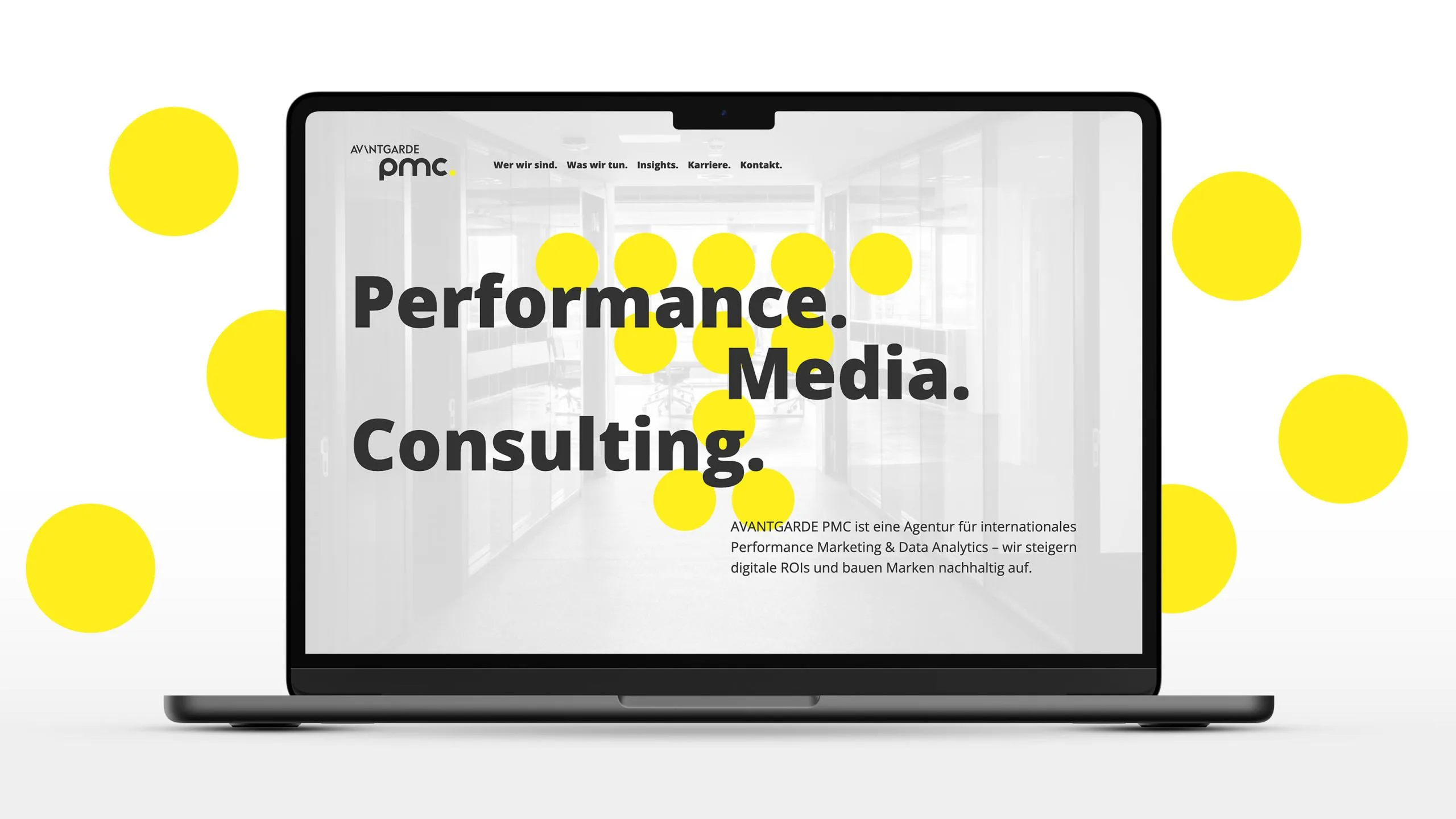
This line of thinking gave rise to the brand’s defining design element. Each dot represents a touchpoint, a target audience, or an interaction. It is only through their interplay that processes, connections, and ultimately performance emerge.

This simple idea forms the foundation of the entire visual language. It makes complex processes understandable, creates brand recognition, and connects strategy with design.

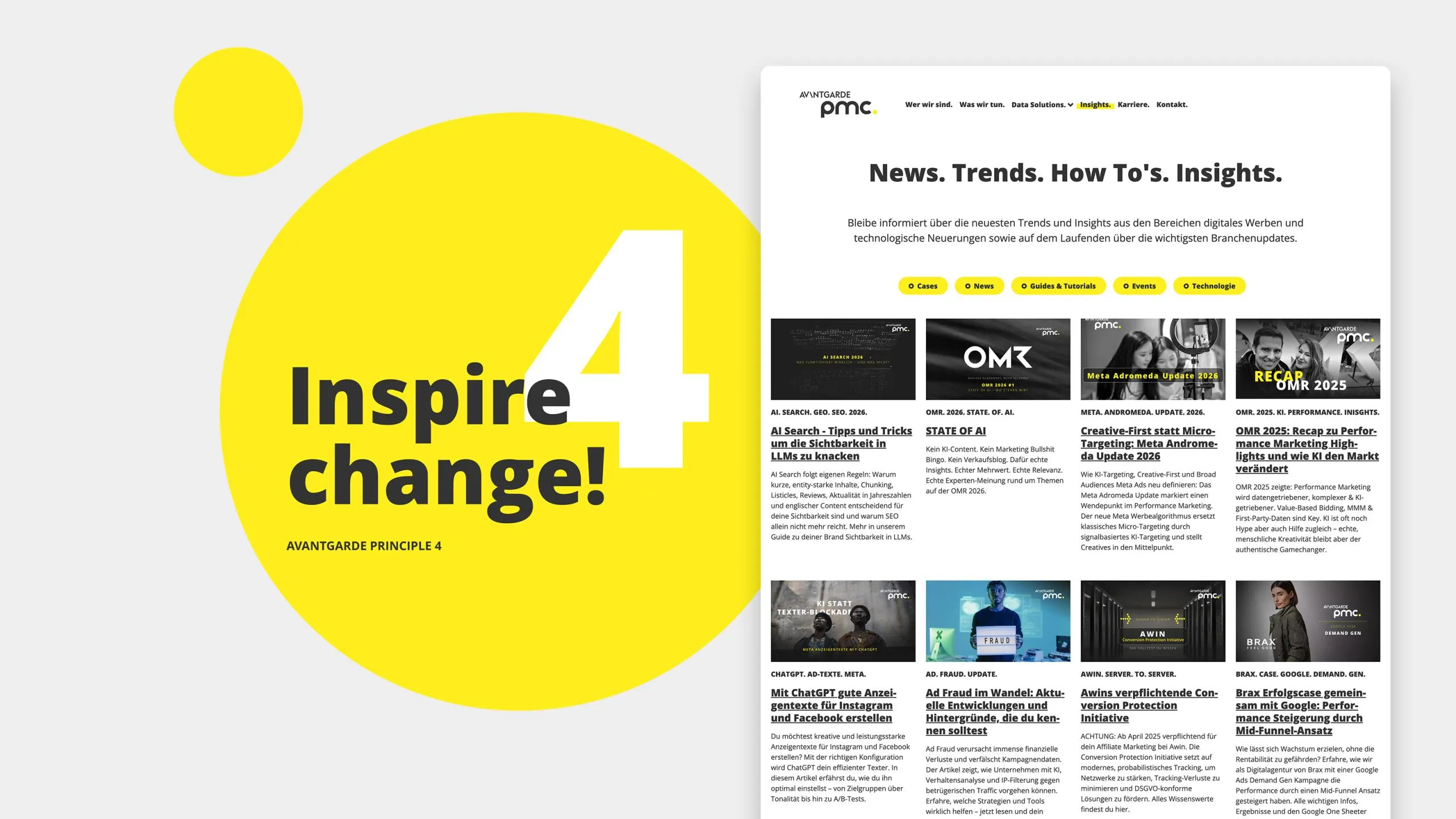
Avantgarde PMC Website
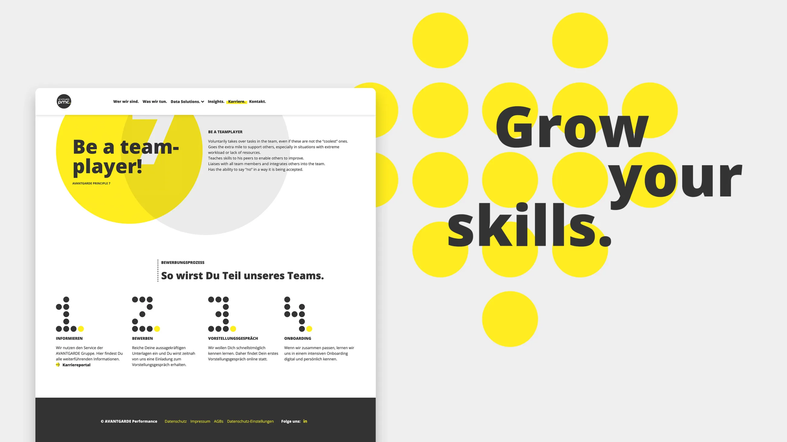
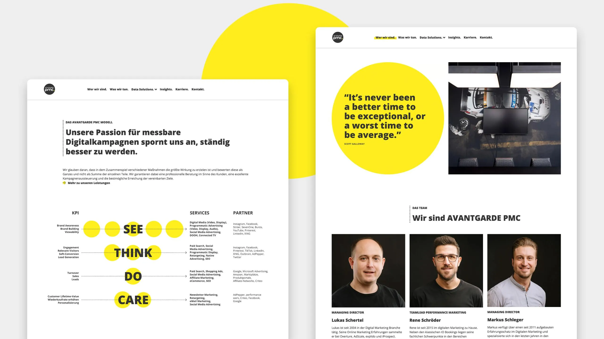
Avantgarde PMC Website Screens
Avantgarde PMC Website Screen mit Funnel

From a single design element to a design system

The dots are far more than just a graphic motif. They evolve into a complete visual language.

They become icons, structure infographics, create movement in animations, and guide users through the website. Sometimes they represent data, sometimes target audiences, and sometimes they provide navigation within the user interface. This results in a flexible system that can be used consistently across all applications.

The minimalist color palette of yellow, white, and dark gray gives this system a distinct identity and ensures that the brand remains recognizable at first glance.

Thinking ahead digitally

The website is not intended to be a static brand presence, but rather a platform that is constantly evolving.

Technically, it is based on Drupal and was built using a modular structure. New content and features can be added flexibly without compromising design consistency.

At the same time, the project places high demands on performance—not just from a technical standpoint. As a specialist in performance marketing, Avantgarde PMC continuously optimizes its own website for SEO and, increasingly, for GEO as well. The website thus becomes a real-world example of the company’s own approach: it is constantly evolving, being analyzed, tested, and improved.
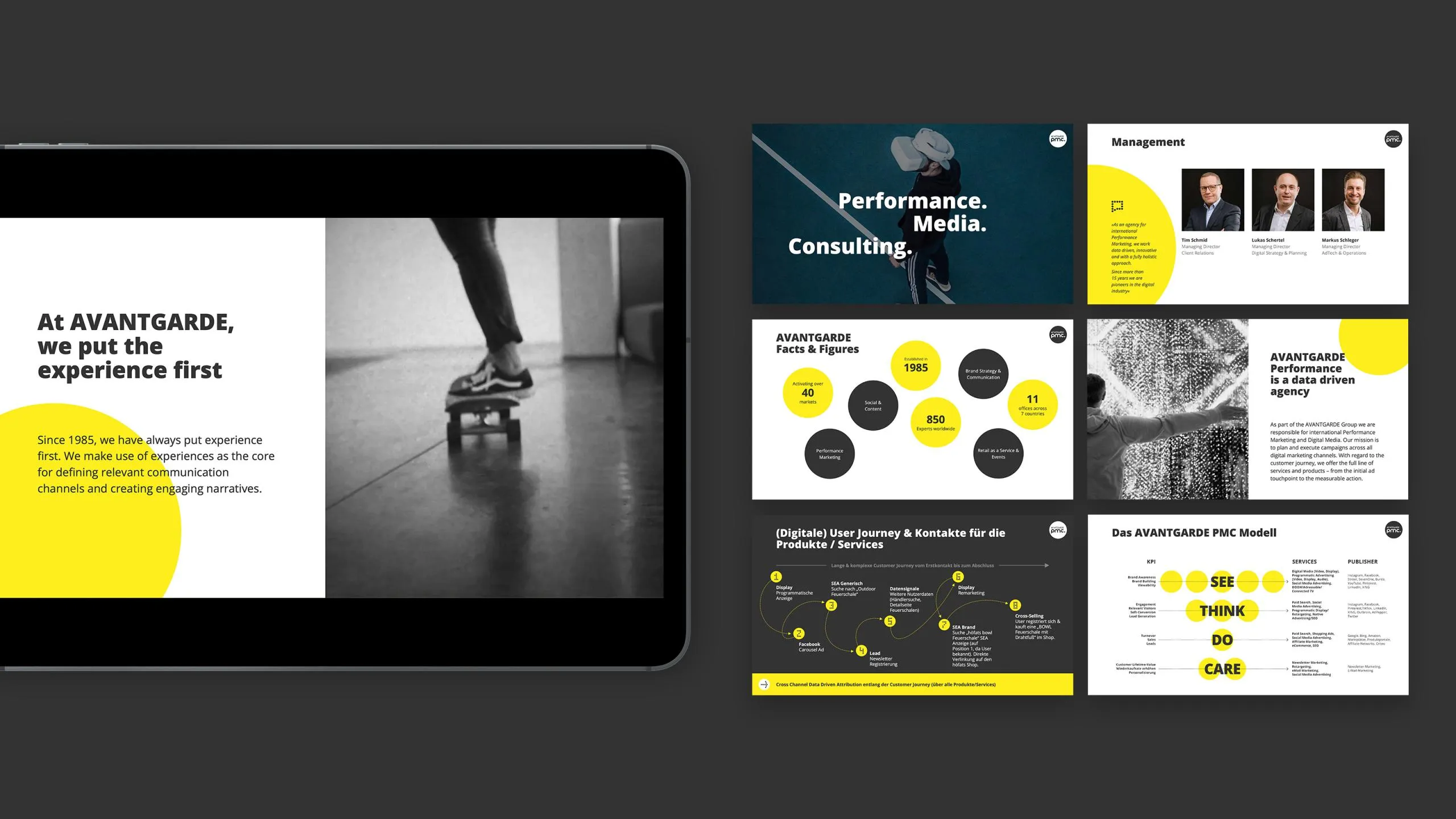
Präsentationsfolien mit gelbem, schwarzem und weißem Design
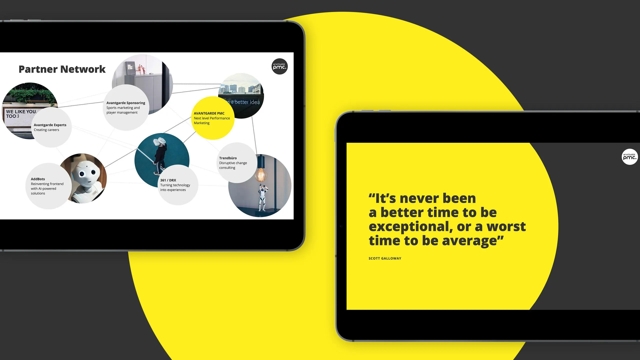
Mockup-Darstellung von Powerpointfolien mit gelbem Kreis im Hintergrund

A brand that grows with you

The design doesn’t end with the website. A comprehensive brand system was developed for everyday use—from pitch presentations and templates to digital communication tools.

This creates a brand identity that functions consistently across every application—not because every medium looks the same, but because they’re all based on the same concept.

Avantgarde PMC Punkte Buchstaben 365
Avantgarde PMC Punkte Icons