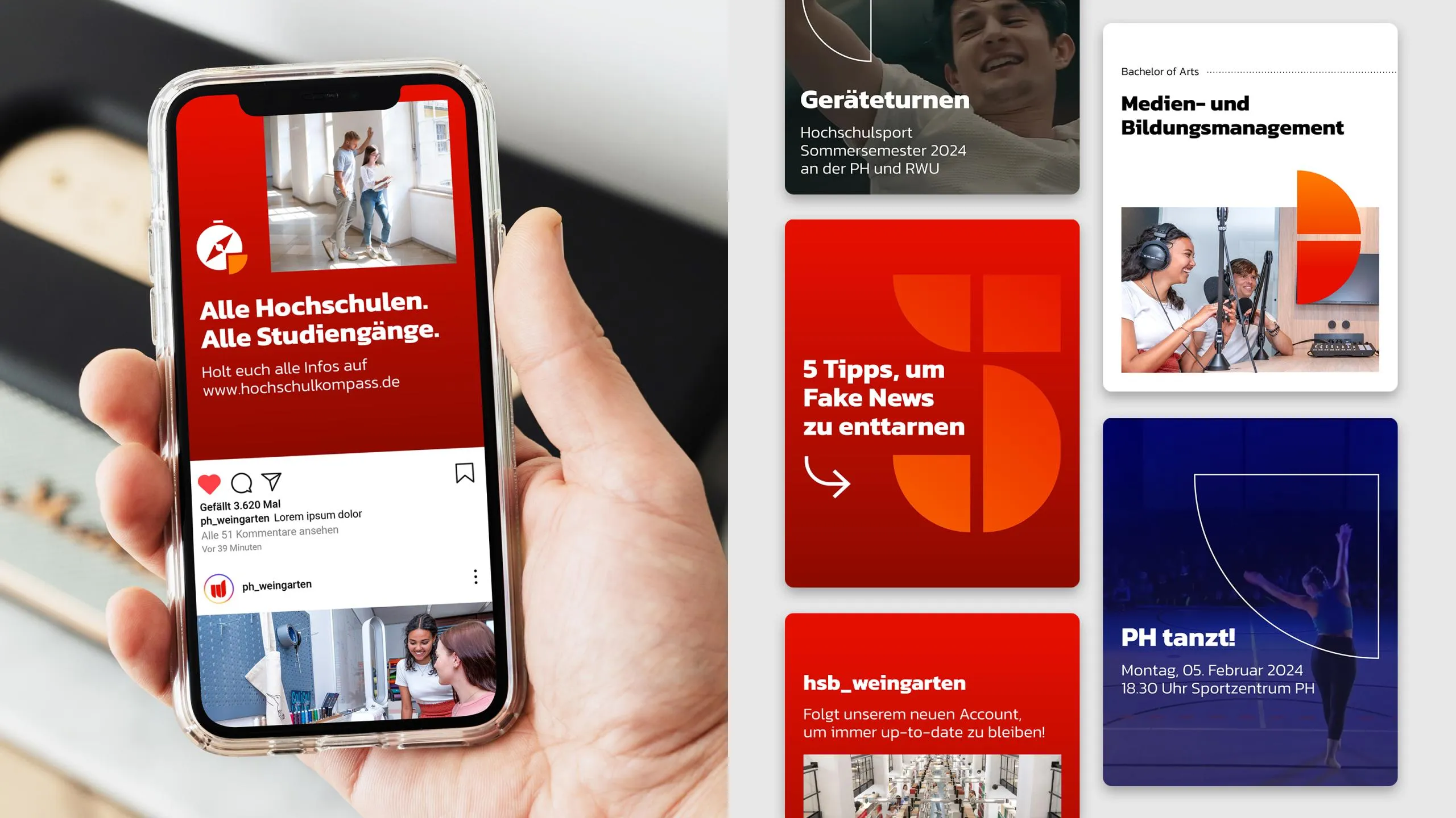
A design that reflects the university’s spirit
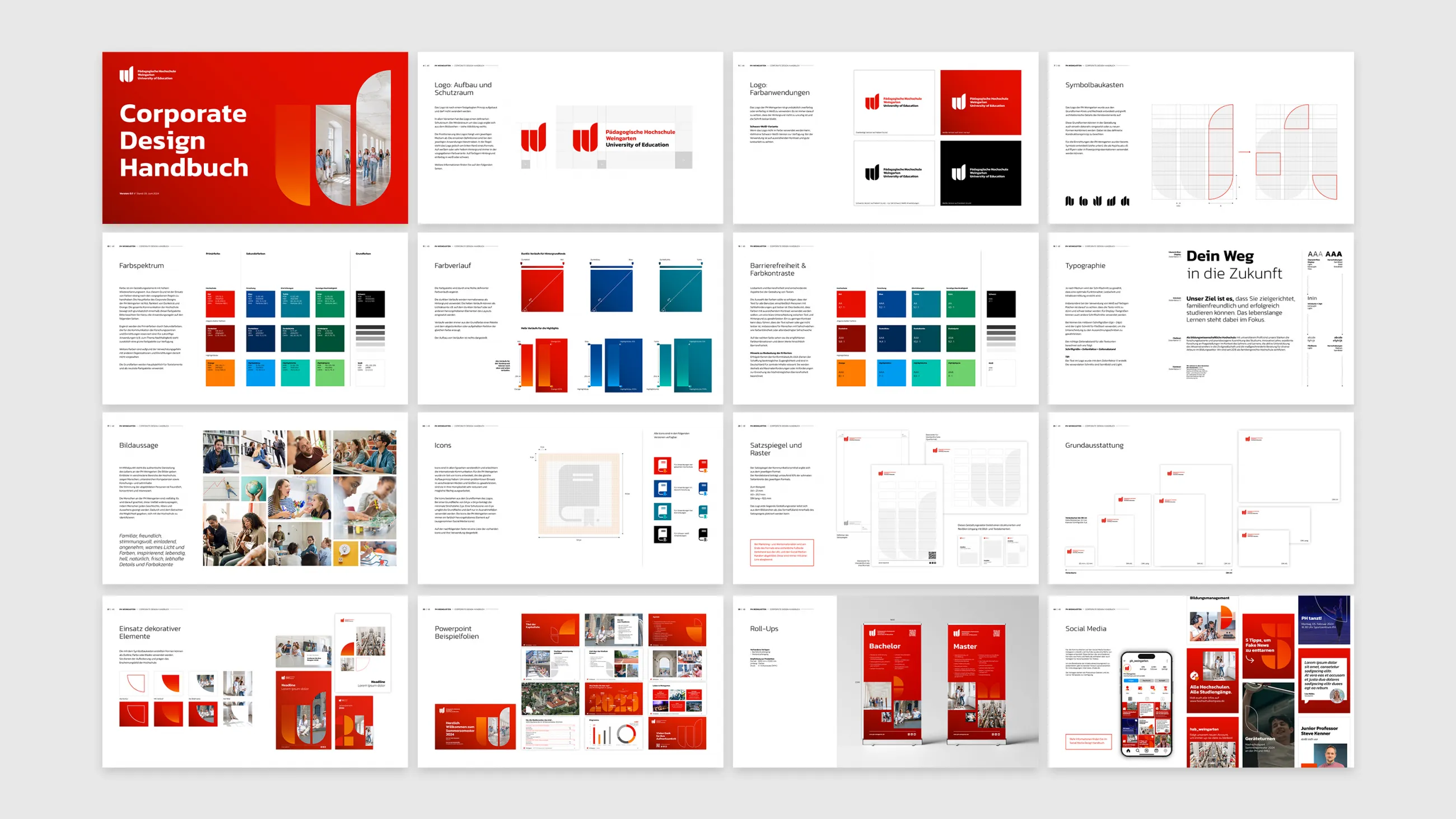
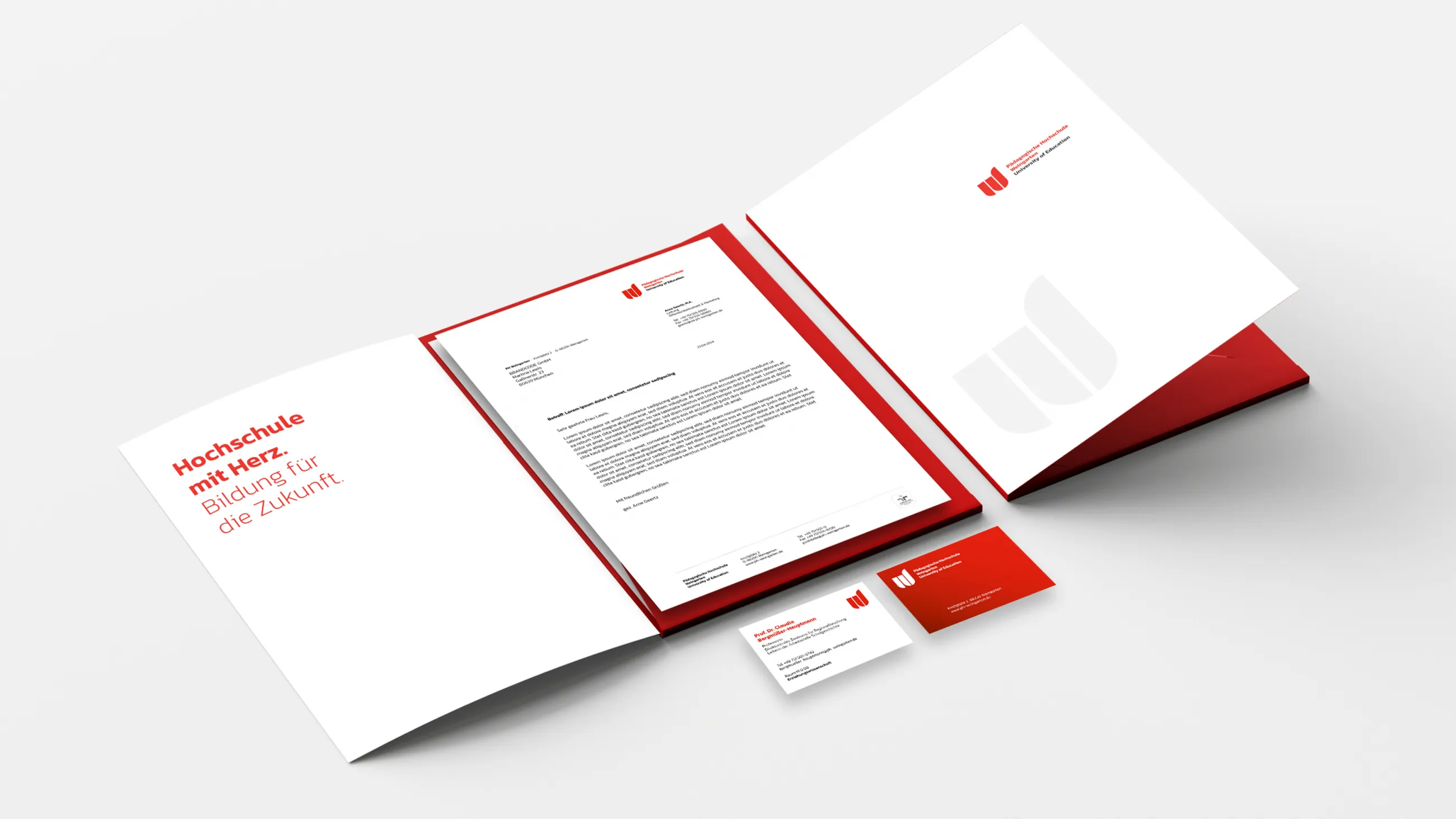
A university with a heart. Education for the future. This guiding principle not only describes the mission of PH Weingarten but also the path to its new visual identity. From the very beginning, it was clear that the new visual identity could only be created collaboratively. In a multi-stage, participatory design process, faculty, students, and staff were actively involved. Step by step, a corporate design emerged that highlights the university’s values and diversity while simultaneously supporting its strategic development.
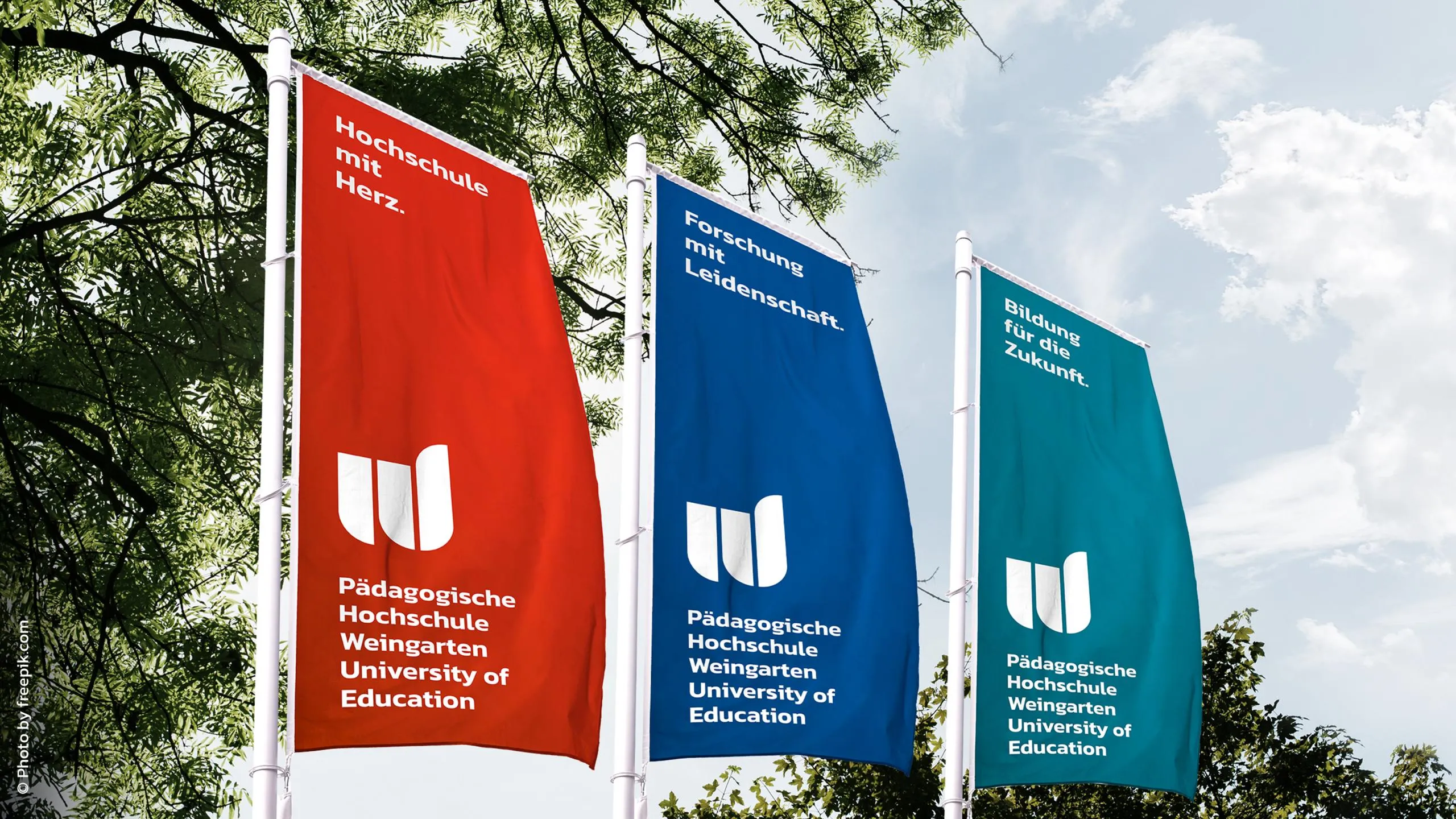
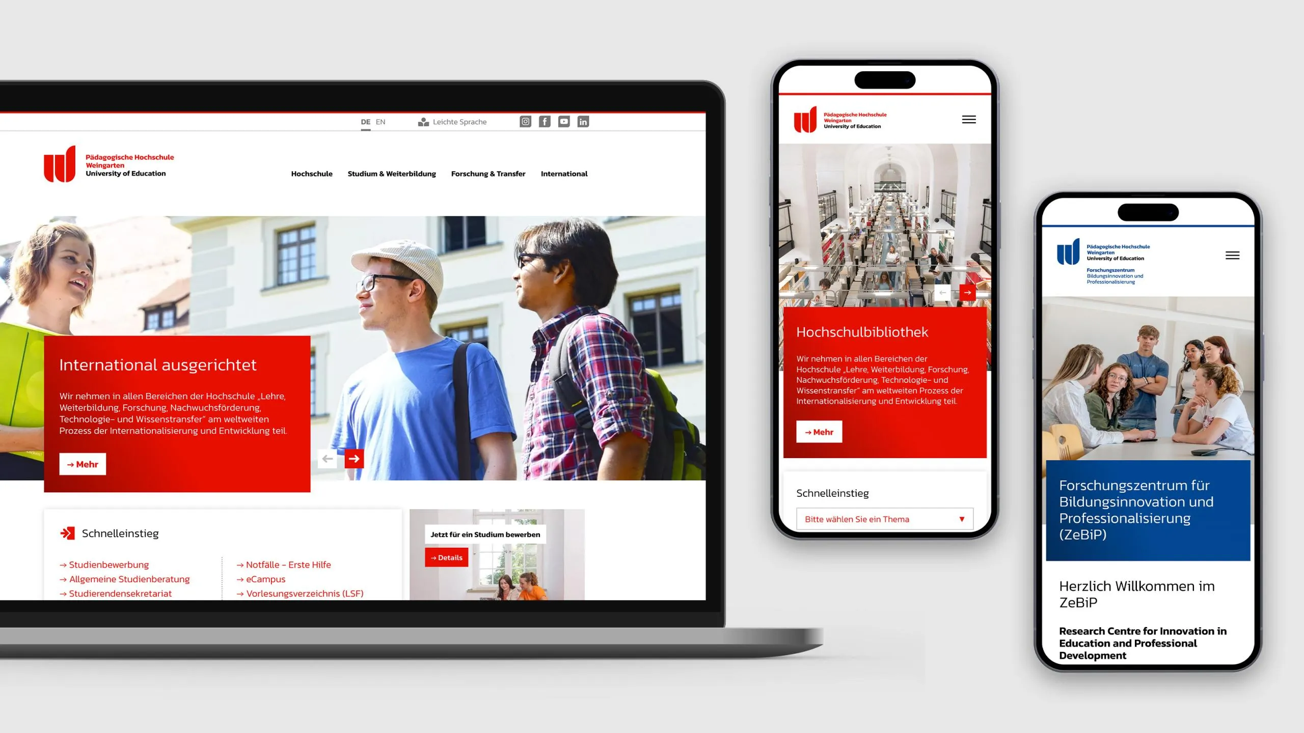
To clearly distinguish between the two central areas of education and research, the design system relies on a deliberate color architecture. Red stands for education, blue for research. Institutions with their own distinct brand identity are assigned a turquoise color scheme. This system provides guidance, enhances brand recognition, and works equally well in print media and digital applications. A flexible design toolkit ensures that the different areas can present themselves independently without losing sight of the shared brand identity.