Skip to main content Skip to main navigation Skip to footer
Cases
Konzepthaus

More Than Just Recruiting

Recruiting is no longer just an end in itself. Anyone who wants to build great teams today must understand what drives people—and what companies really need. This is exactly where the story of Konzepthaus begins. Not as a traditional recruiting agency, but as a partner for creative organizations that want to grow and evolve.

Konzepthaus logo in yellow lettering on a dark blue background

Teams don't just happen by chance

Hardly any other topic is discussed as intensely as the shortage of qualified professionals. For many companies, the competition for talent seems to have become the biggest problem.

Konzepthaus takes a more nuanced view. The crucial question is not whether there is enough talent, but how companies can become places where people stay and can realize their potential.

This approach quickly made it clear: this is about much more than just recruiting. Konzepthaus supports its clients from strategic consulting through the development of high-performing teams to continuing education. This positioning also needed to be reflected in the brand’s identity.

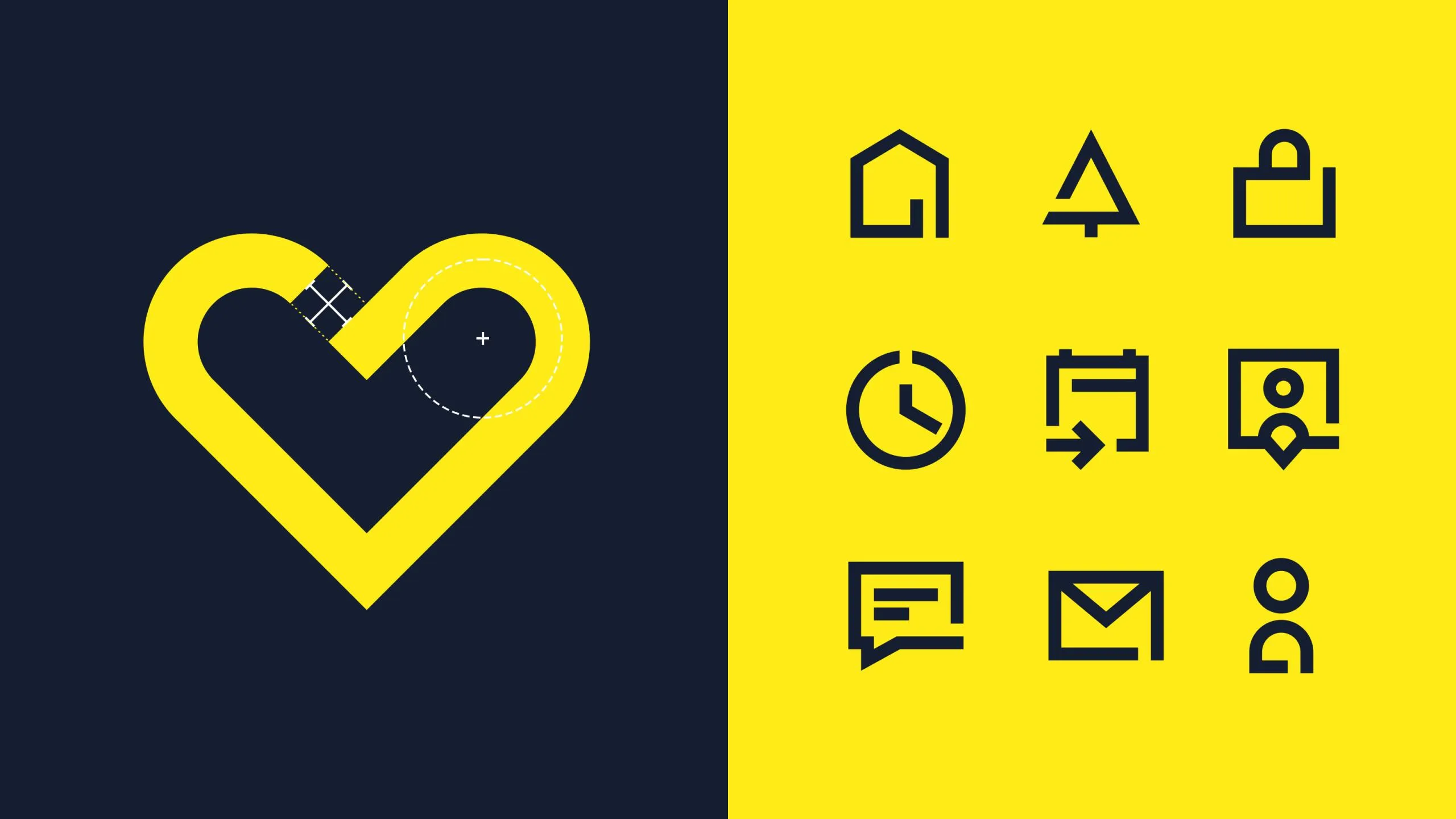
Icons, such as a heart and navigation symbols, on a dark blue and yellow background
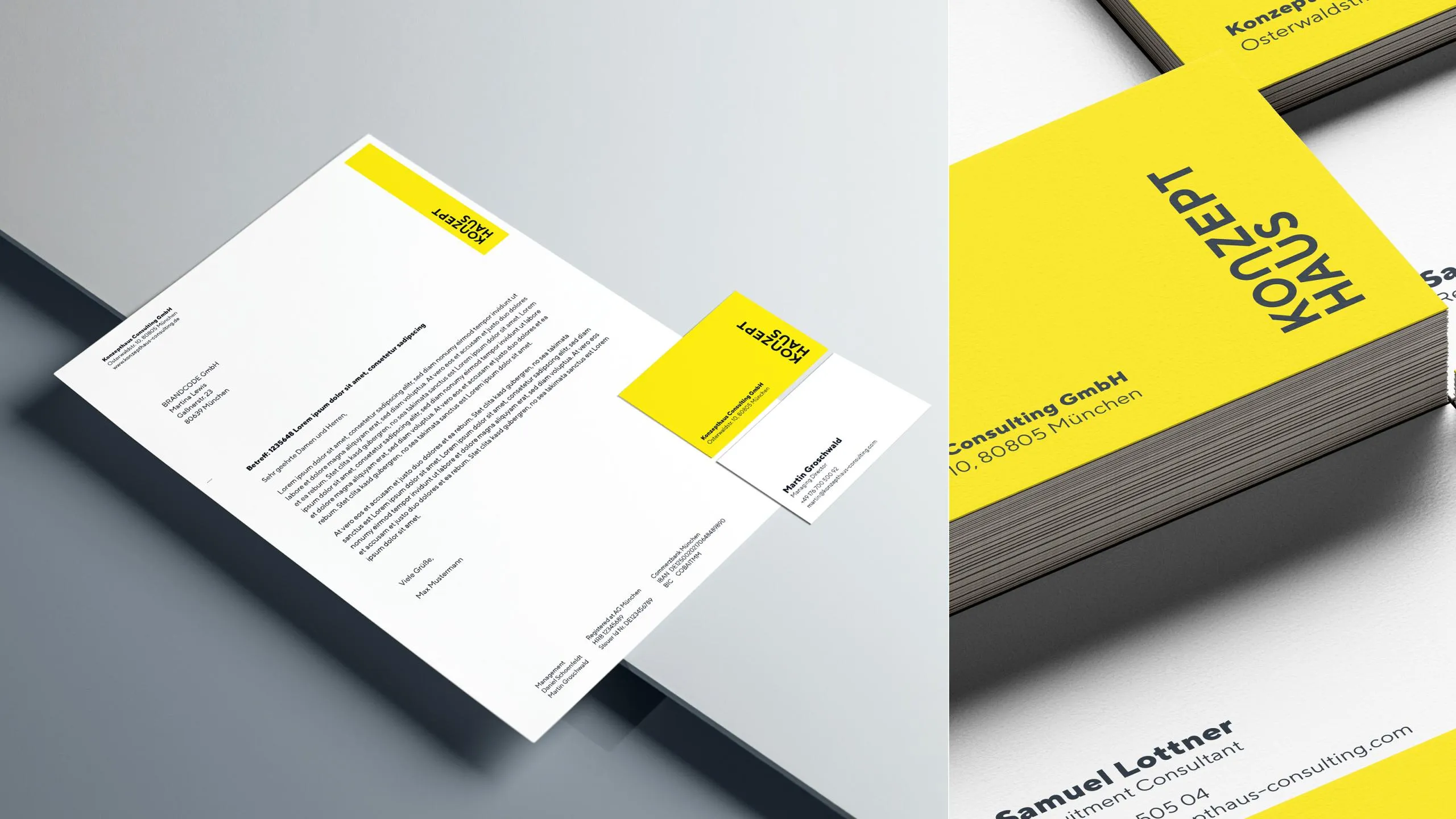
Mockup of stationery and business cards in white with yellow accents

An identity that has grown alongside the company

In a collaborative process spanning several months, the Konzepthaus brand was refined and its profile realigned. The goal was to bring the various offerings together under a clear identity and highlight what makes the company unique.

The guiding principle “We build creative teams.” became more than just a tagline. It describes Konzepthaus’s self-image—and serves as the common thread running through communication, design, and brand management.

Connection as a central design element

The new corporate design translates this philosophy into a distinctive visual language. The lettering evolved into a striking logo that symbolizes connection, collaboration, and openness—qualities that shape both collaboration within teams and partnerships with clients.

Vibrant colors, minimalist typography, and striking graphic elements create a clear, direct visual identity. The design system remains flexible enough to consistently bring together different themes, services, and brand areas while supporting future growth.
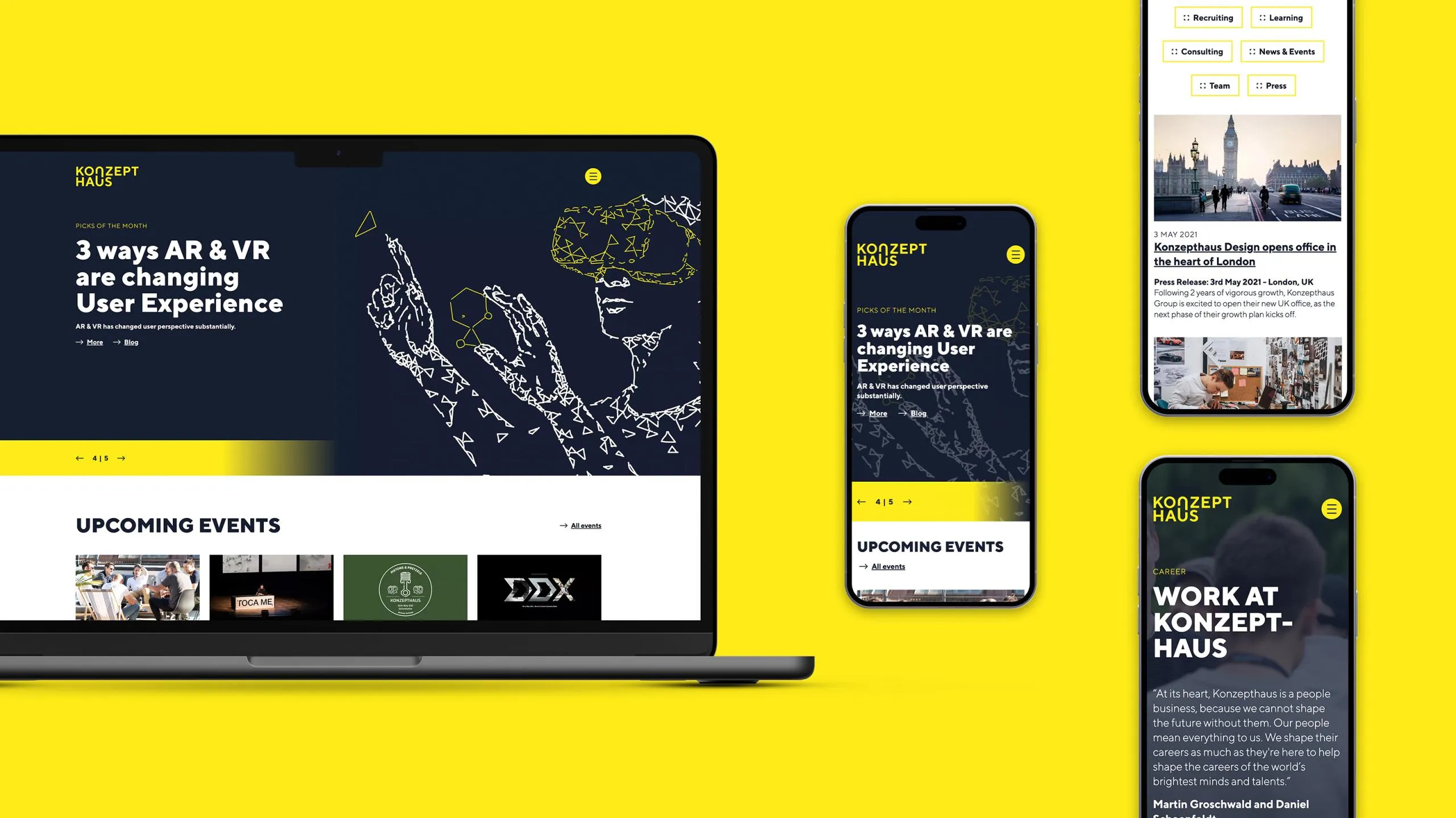
Responsive web design on a laptop, tablet, and smartphone with a yellow background
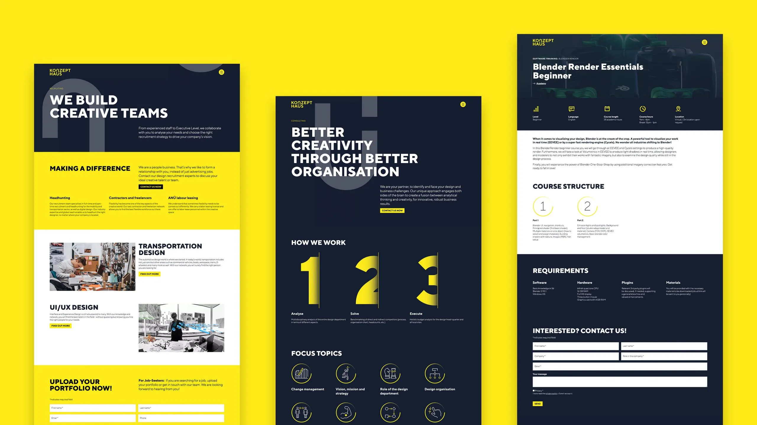
Three website mockups on a yellow background with different layouts and designs
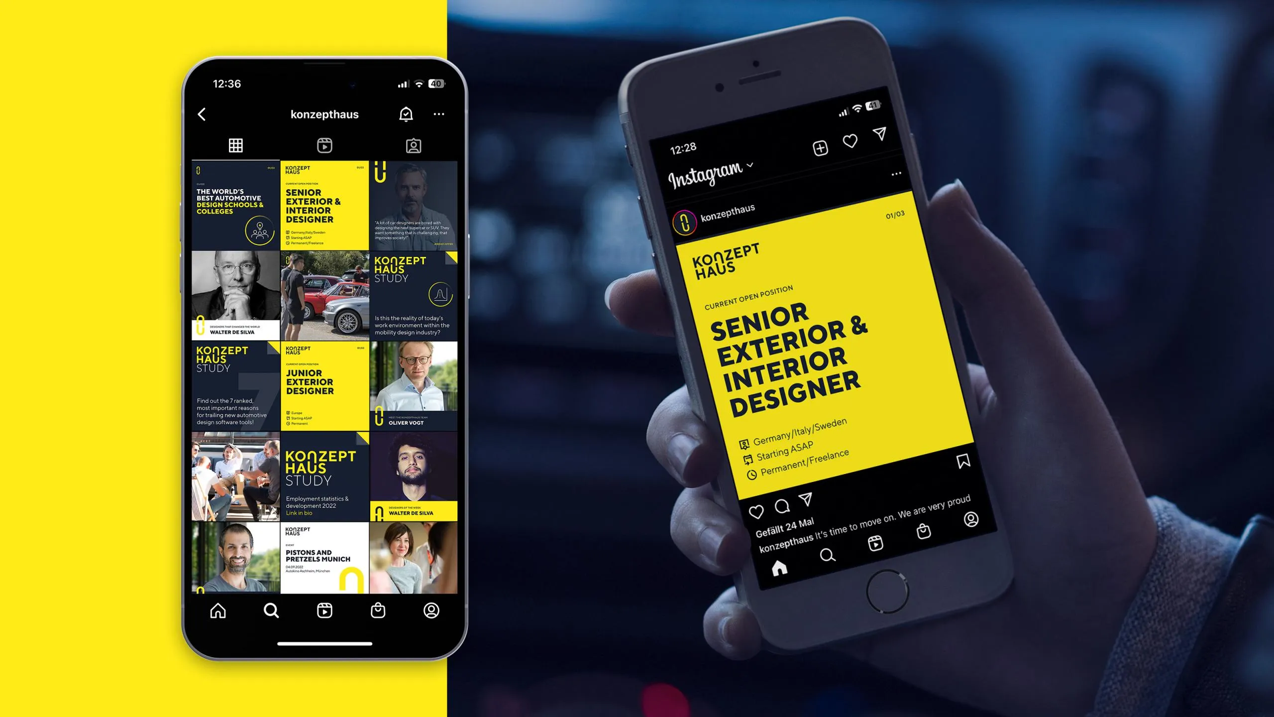
Two smartphones display social media posts

Flexibility doesn't stop at design

The website also follows this philosophy. It was built with a consistent modular structure, offering the Konzepthaus team maximum freedom in maintaining and further developing the content. New pages, campaigns, or topics can be implemented without any technical hurdles. This keeps the platform just as agile as the company itself.

The client’s feedback was particularly gratifying: working with the new system was so enjoyable that what started as a routine editorial task turned into genuine enthusiasm. There’s hardly a better sign that design and user-friendliness go hand in hand.

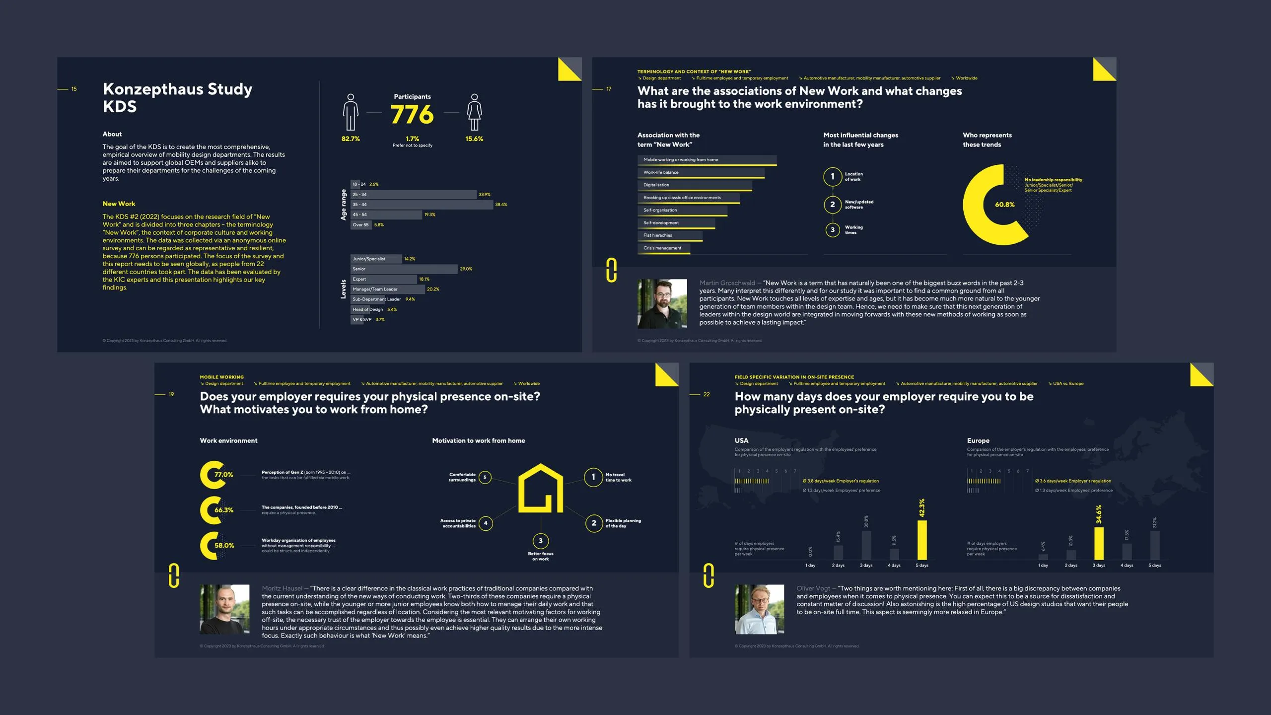
Infographic featuring statistics and icons in yellow and dark blue, displaying business data and people
Tablet with pie charts from the Konzepthaus KDS Report
Presentation slides on a dark background with yellow accents

Conclusion

The new brand identity clearly conveys what Konzepthaus stands for today: not simply matching people, but developing successful creative teams. It is a brand that demonstrates a clear stance, provides direction, and creates room for further growth.

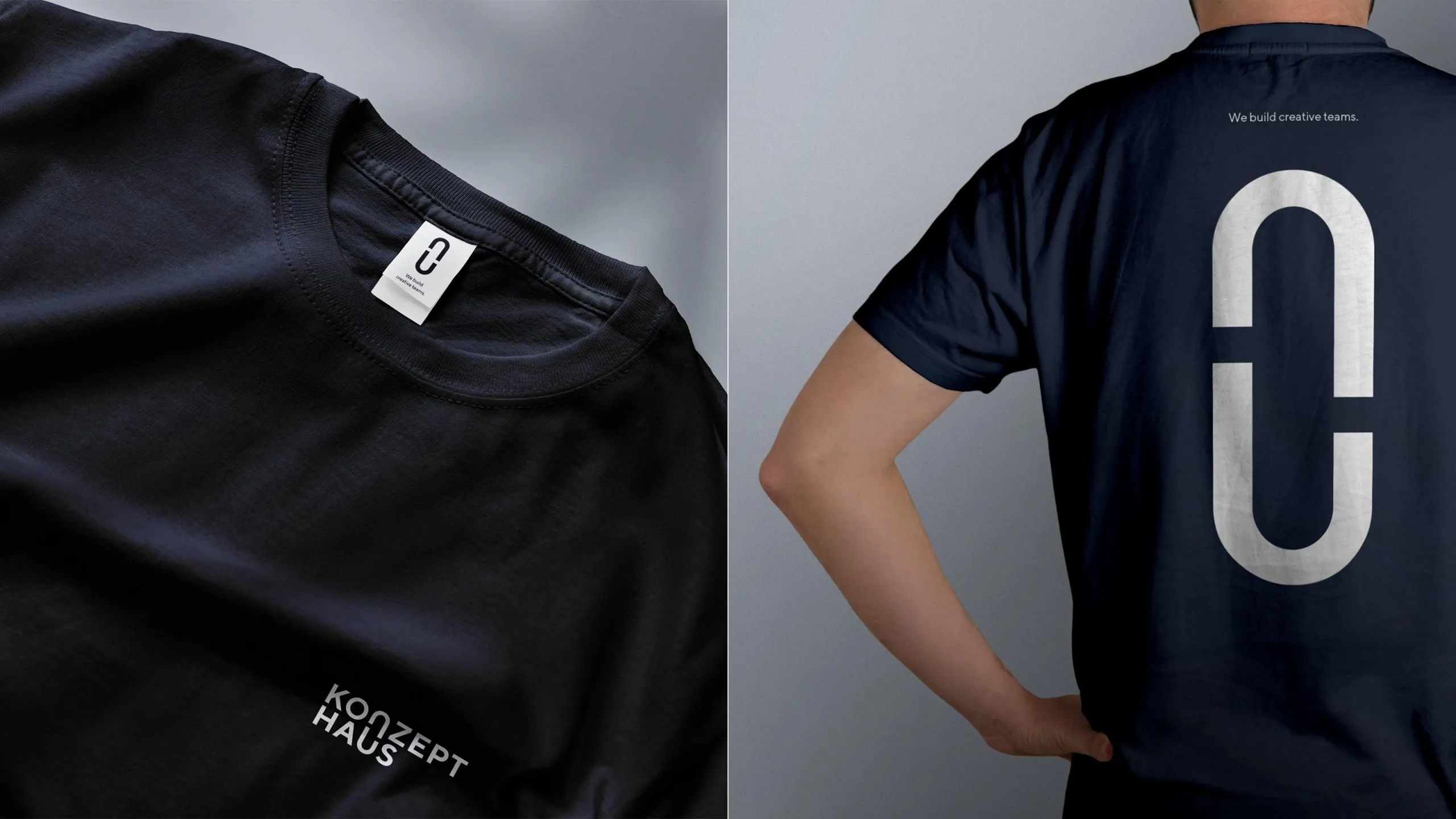
Black T-shirt with a white logo on the front and back