Skip to main content Skip to main navigation Skip to footer
Cases
Drupal Germany

A brand for the Drupal open-source community

A community thrives on change. It grows, evolves, and changes along with the people who shape it. New technologies, new expectations, and new forms of collaboration also shape its identity. This was precisely the situation Drupal Deutschland found itself in—and with it came the question of what a corporate design should look like that not only works today but will also support the community in the future.
How an established brand evolved into a contemporary brand identity

Drupal is one of the world’s leading open-source content management systems. Behind the software is an international community with millions of users, thousands of contributors, and local organizations around the world. In Germany, Drupal e.V. serves as the central hub for events, knowledge sharing, and community engagement.

With the introduction of the new international Drupal branding, there was a desire to rethink the visual identity of Drupal Germany as well. The goal was not to create a new identity, but rather to consistently evolve the existing one—bringing it closer to the global brand, making its communication clearer, and better suited to the needs of a digital community.

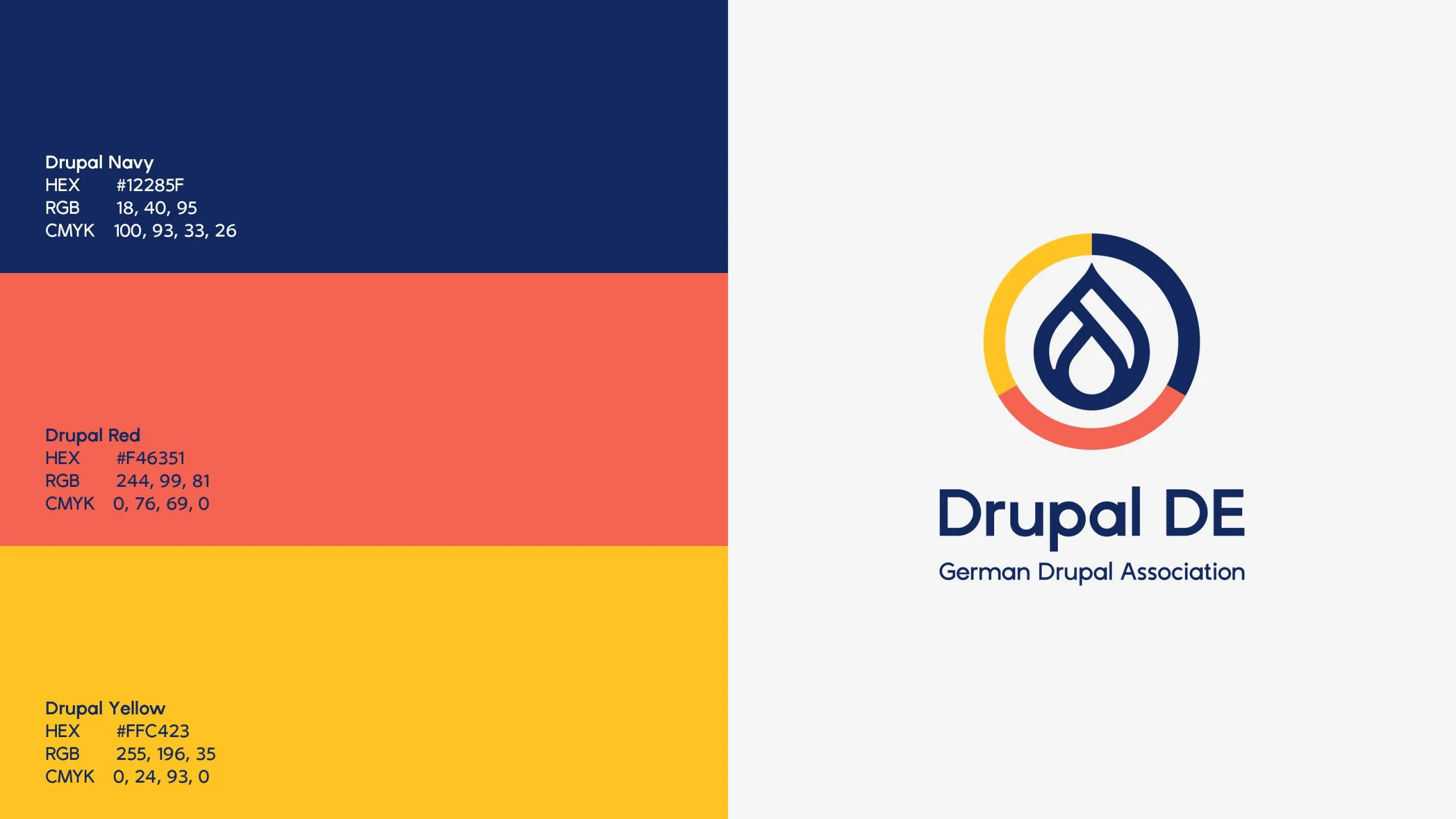
Drupal DE Logo mit Farbpalette in Dunkelblau, Rot, Orange und Gelb mit RGB- und Hex-Codes

Less logo. More brand.

The previous visual identity had been with the community for many years. At the same time, it had become clear that it no longer met today’s requirements. The logo was difficult to read at small sizes, lacked impact on digital channels, and was hard to use flexibly. At the same time, the association’s legal form had come to take center stage over the actual brand: Drupal Deutschland.

From a design perspective, too, the gap between the German brand and the international Drupal brand had become clearly visible. While Drupal continued to evolve globally with a modern, minimalist visual identity, the German brand’s visual identity lagged behind this development.

The task, therefore, was not to create something entirely new, but to intelligently build upon what already existed. The goal was a visual identity that would reflect the international brand identity while offering sufficient distinctiveness to represent the German community.

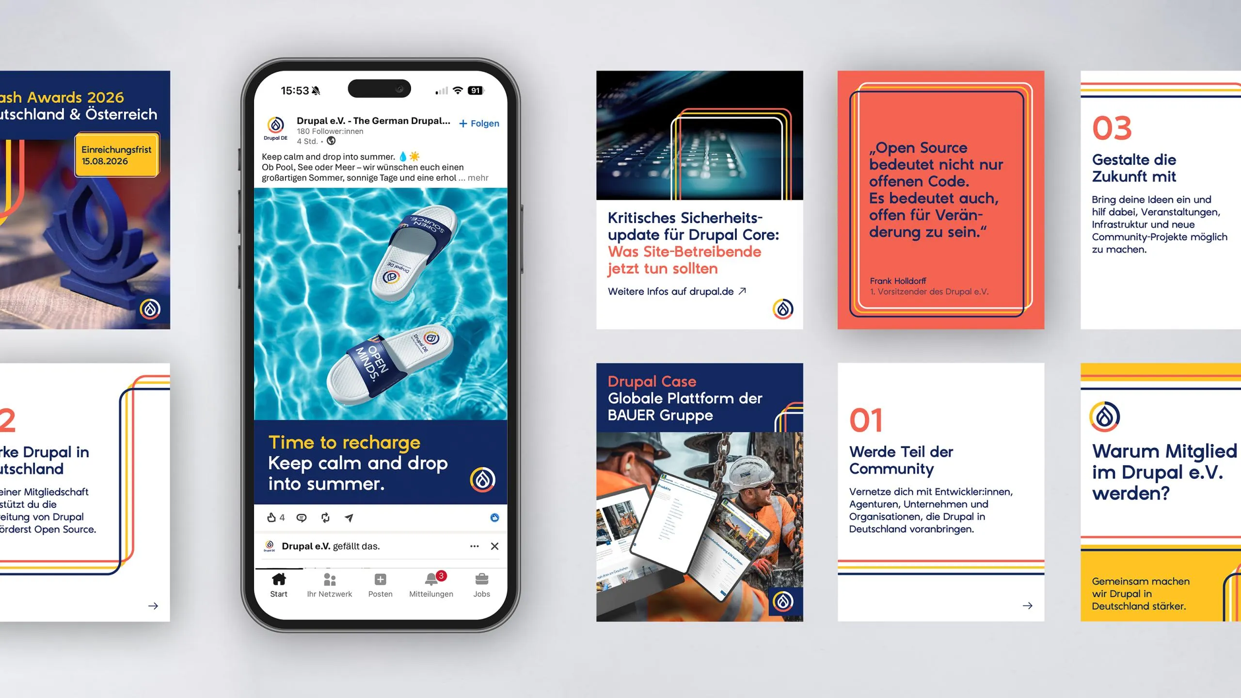
Sammlung verschiedener Social-Media-Beiträge und Smartphone-Ansichten auf grauem Hintergrund

A question of identity

The starting point was a redesign of the logo. However, it quickly became clear that a new logo alone would not solve the challenges.

That’s why we developed a comprehensive corporate design that goes far beyond the logo. Colors, typography, visual language, and graphic elements were redefined and integrated into a flexible design system. It lays the foundation for consistent communication—from the website and social media to meetups, conferences, presentations, and future marketing initiatives.

Instead of rigid design guidelines, a system was created that can grow with the community while simultaneously strengthening the brand’s recognition value.

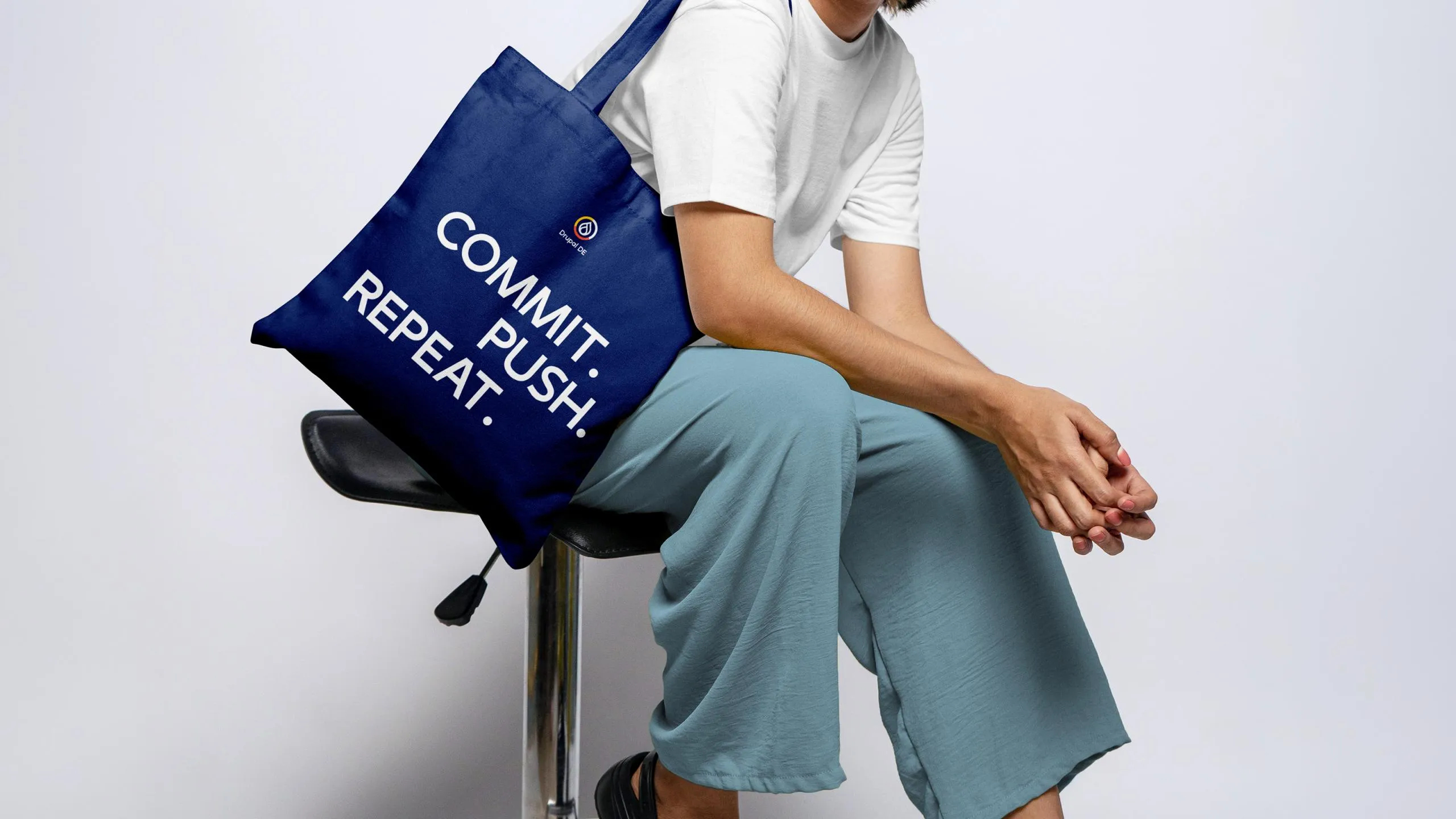
Person auf Stuhl mit blauer Stofftasche mit weißer Aufschrift

Design that makes belonging visible

Corporate design is about more than just brand recognition. It conveys values, builds trust, and connects people.

With its new brand identity, Drupal Germany is clearly positioning itself as part of the international Drupal community. At the same time, the German organization is gaining a distinct visual identity that looks professional, works across all digital channels, and offers sufficient flexibility for future developments.

The result is a corporate design that not only looks more modern but also strengthens the brand in the long term.

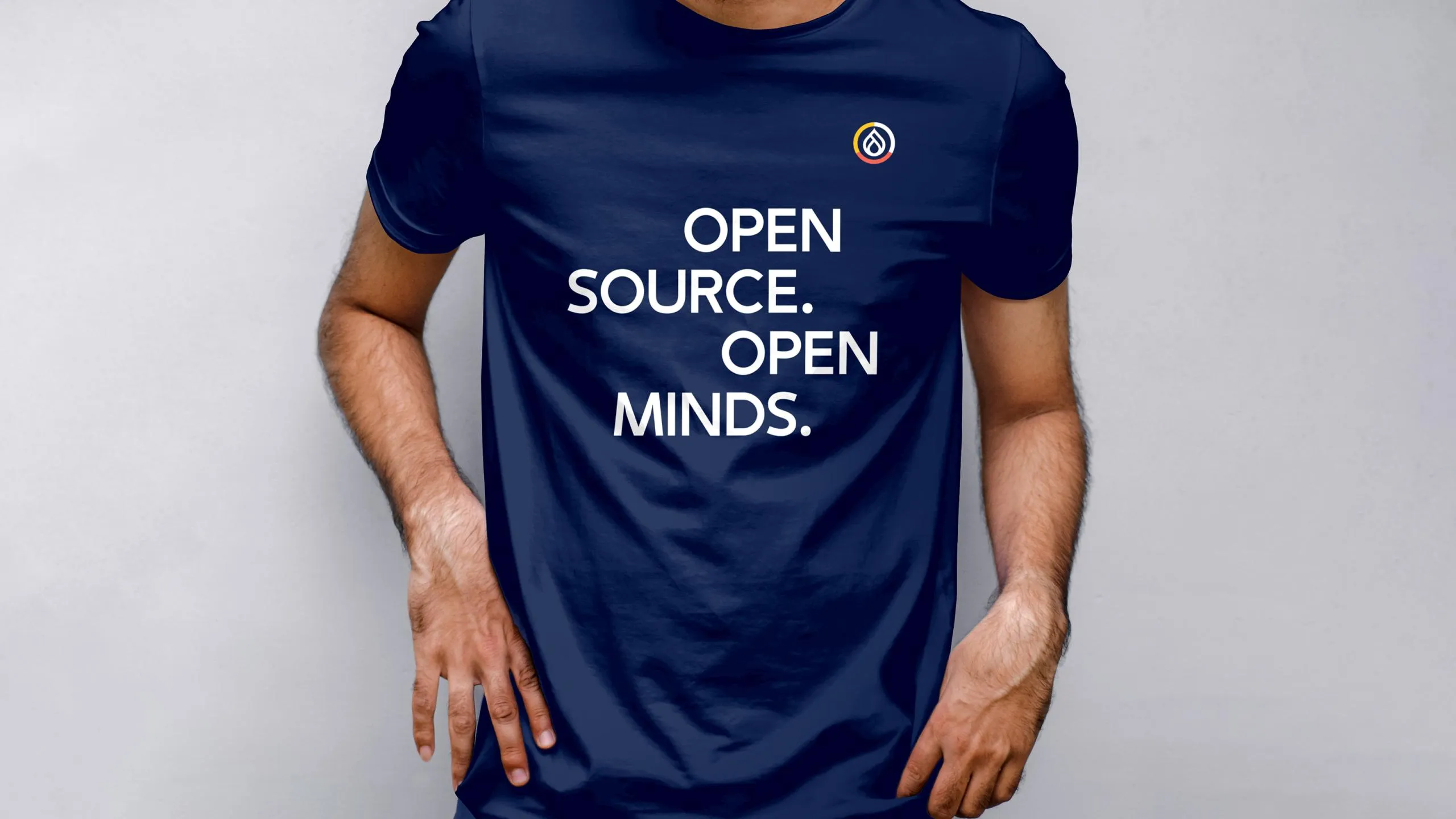
T-Shirt und Tasse mit Aufdruck