Skip to main content Skip to main navigation Skip to footer
Cases
Concept House

Building creative teams

We don't talk to recruiters! Or do we? For this project, we even had the opportunity to help shape the corporate identity.

Konzepthaus logo in yellow lettering on a dark blue background
Icons, such as a heart and navigation symbols, on a dark blue and yellow background
Mockup of stationery and business cards in white with yellow accents

One of the defining trends of our time is the desperate search for qualified personnel—across all industries. Where have all these people gone? Are we in the midst of a “war for talent”? Martin says, “No, that’s nonsense.” And this from a recruiting expert! Isn’t he calling his own industry into question? Even after the first few conversations, it was clear to us: the question isn’t whether Konzepthaus is needed. Because Konzepthaus isn’t just a recruiting agency; it helps companies make their creative teams even more successful. And, of course, find and retain the right people.

“We build creative teams” is therefore not just a slogan, but a promise that goes beyond recruitment. Over a six-month process, we worked together with the team at Konzepthaus to sharpen their profile, establish a clear point of differentiation within the industry, and create a brand identity that communicates the various facets in a way that is both appealing and tailored to the target audience.

Responsive web design on a laptop, tablet, and smartphone with a yellow background
Three website mockups on a yellow background with different layouts and designs
Two smartphones display social media posts

The new corporate design is a visual expression of the company’s refined identity.
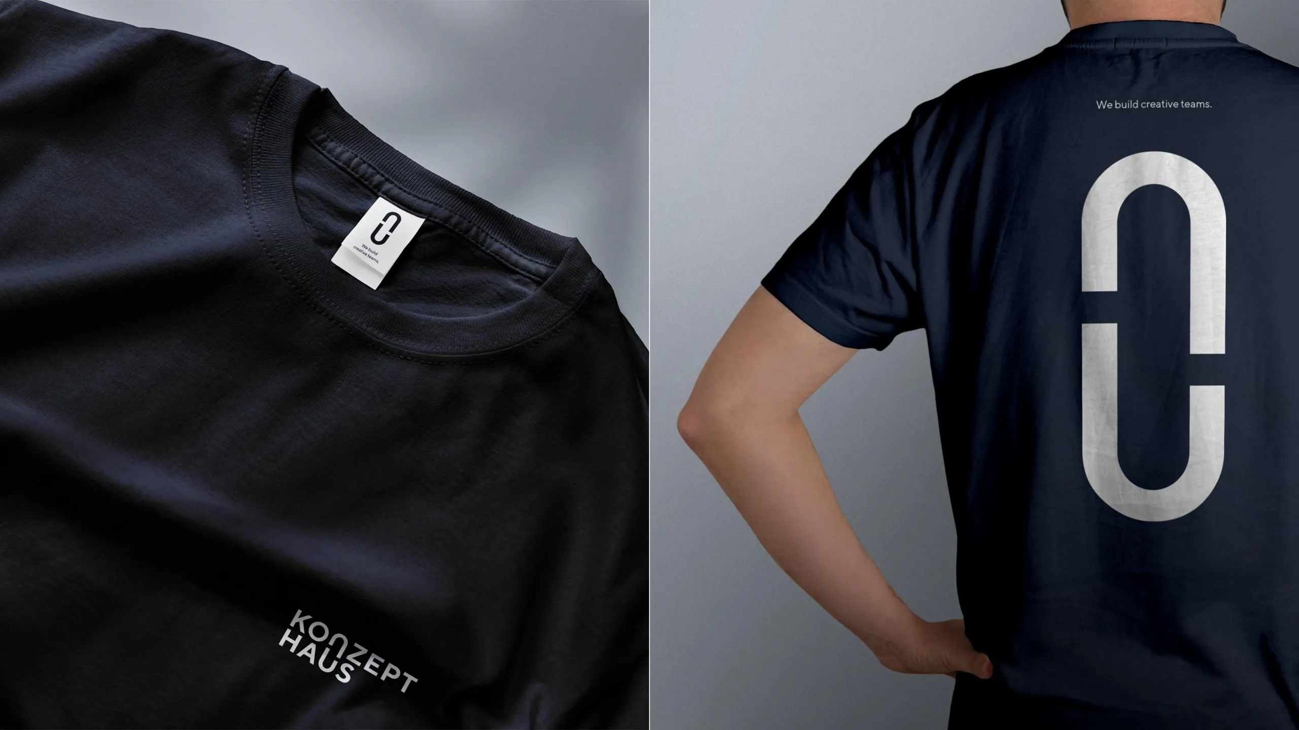
The core element of the corporate design is the symbol derived from the lettering, which consists of the letters N and U. Symbolically, the logo represents the connection between teams and flexible, open collaboration—both internally and, above all, with clients. This begins with strategy, encompasses all aspects of HR consulting, and supports the professional development of client teams through the Academy. In addition to the design overhaul, the stated goal of the rebranding was therefore to consolidate the various brands and develop a strong, flexible structure that supports expansion and growth.

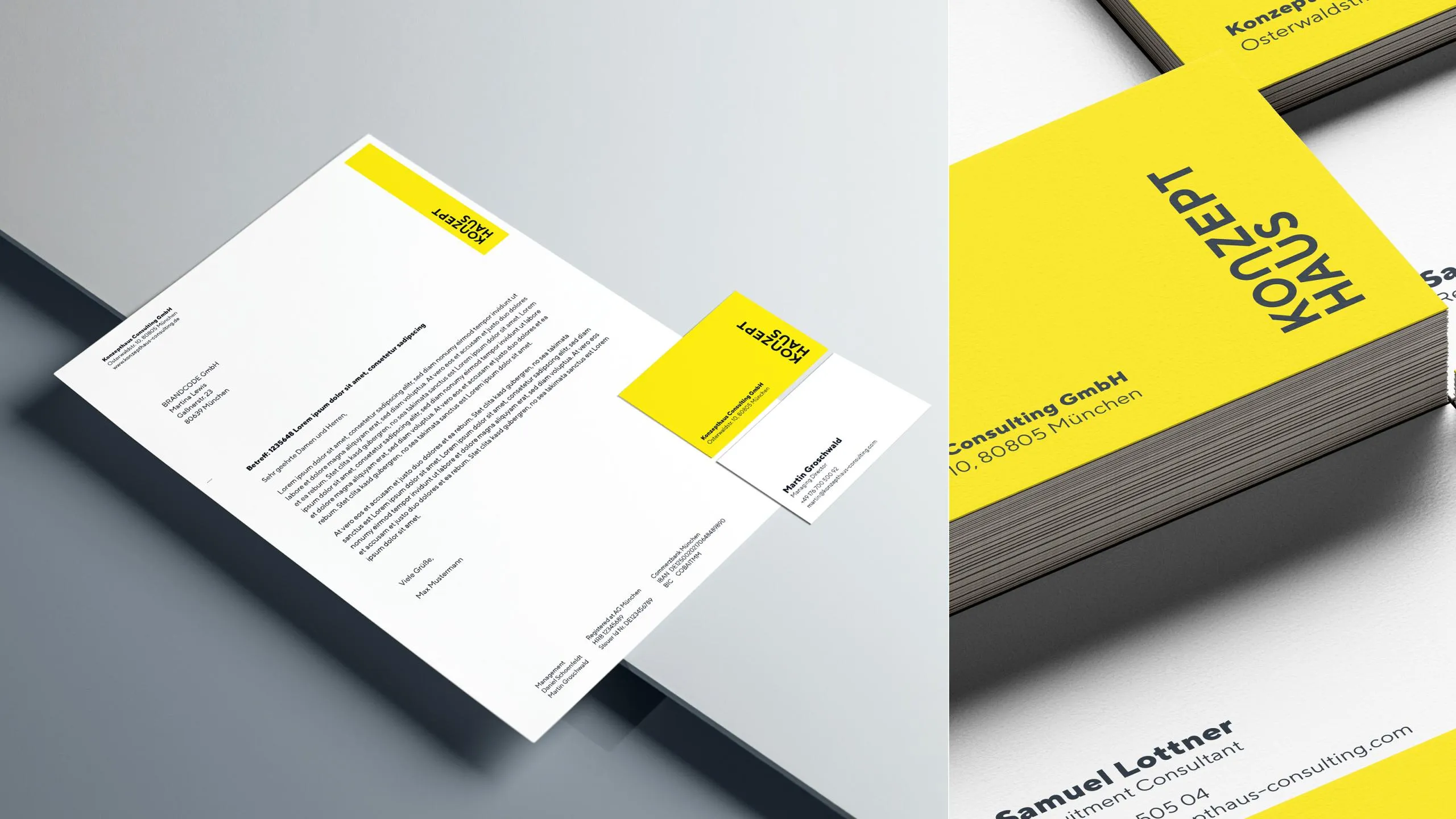
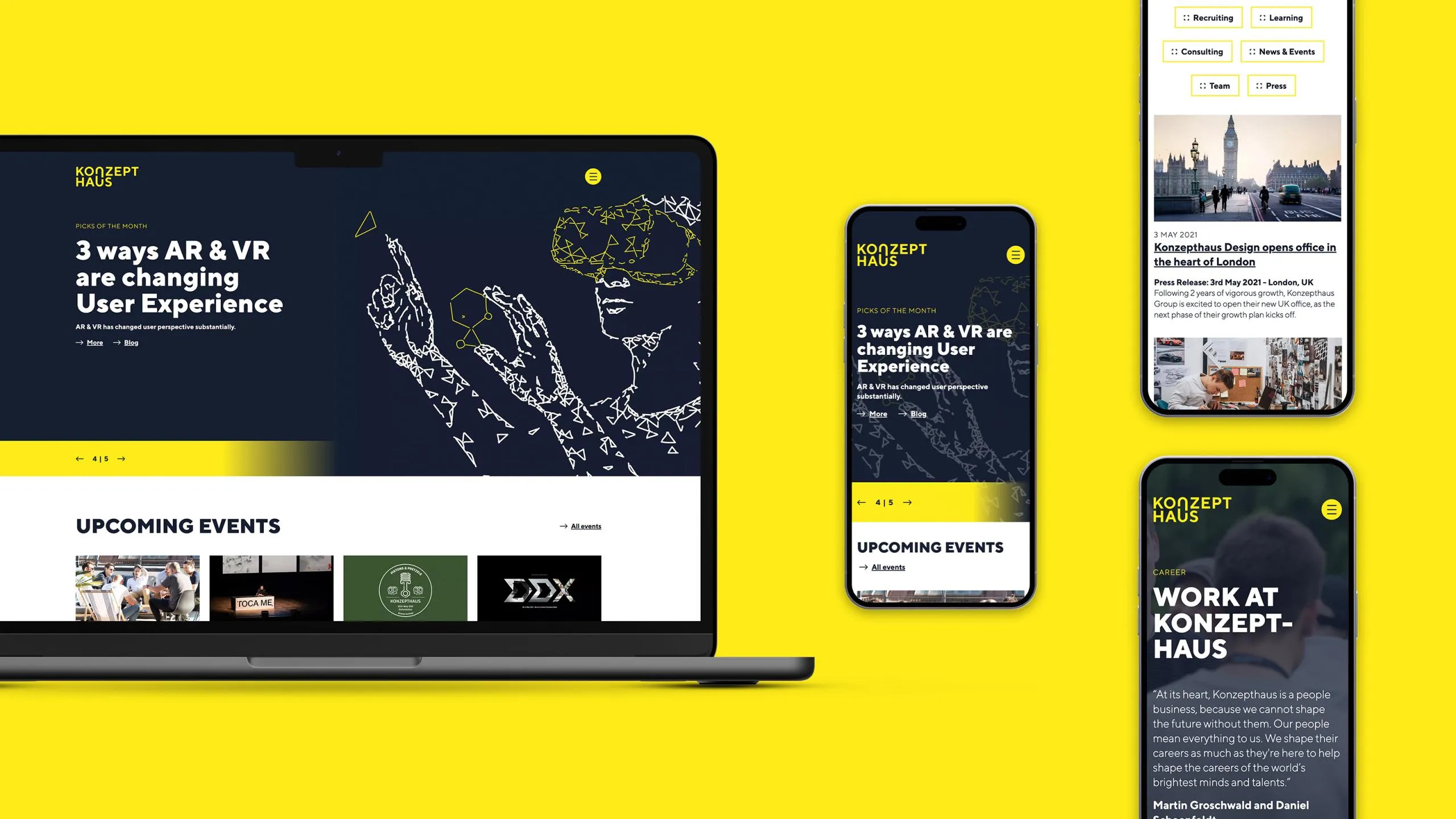
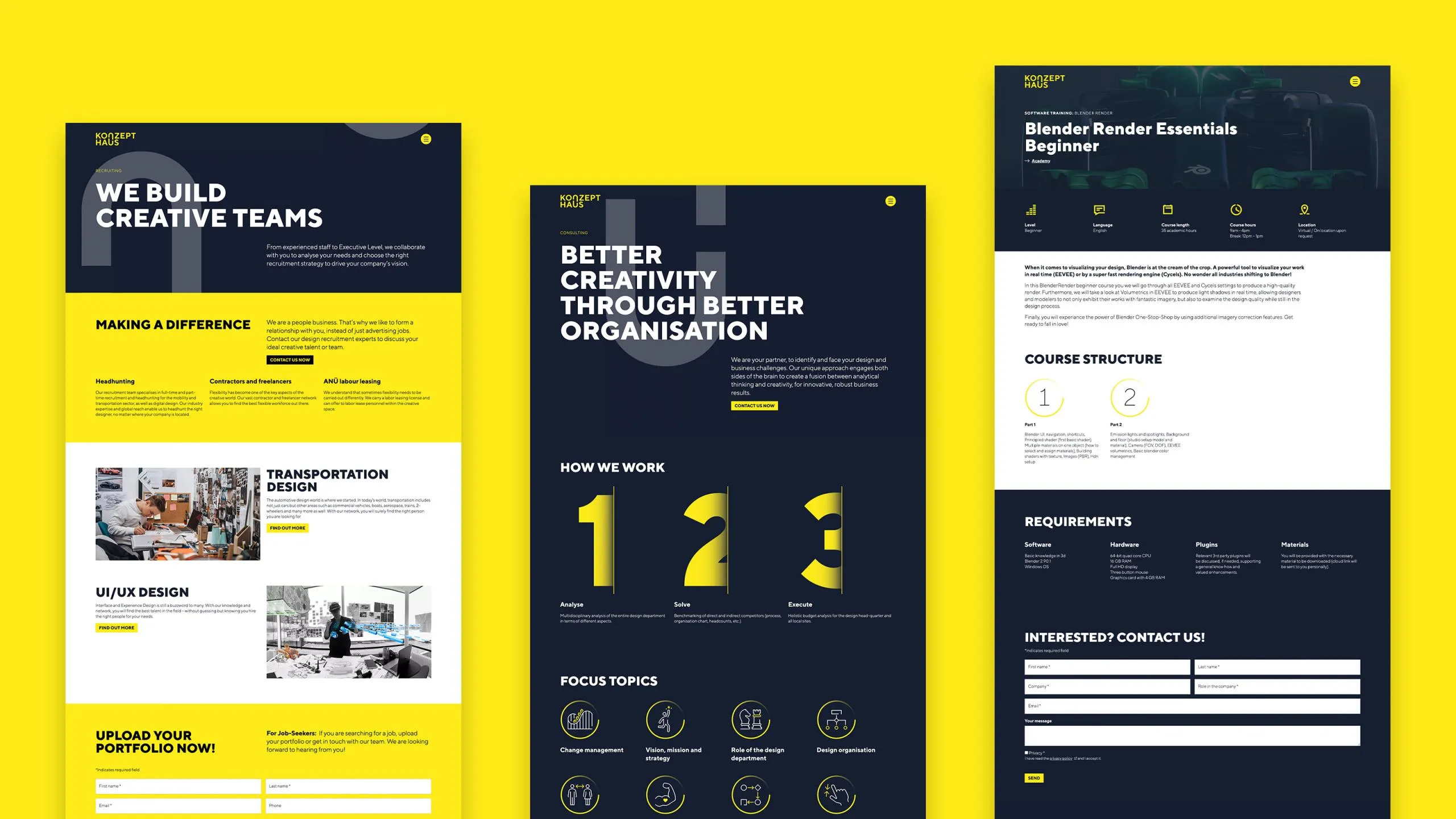
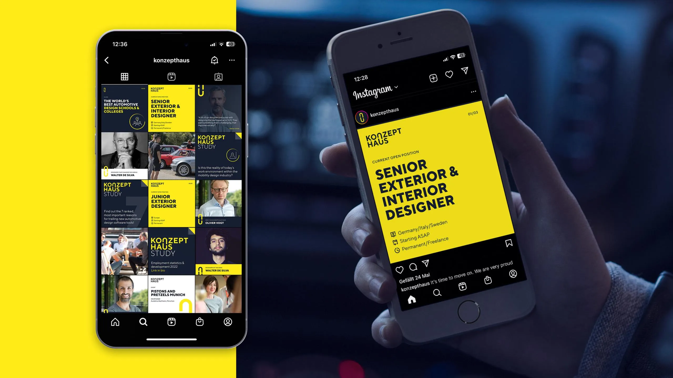
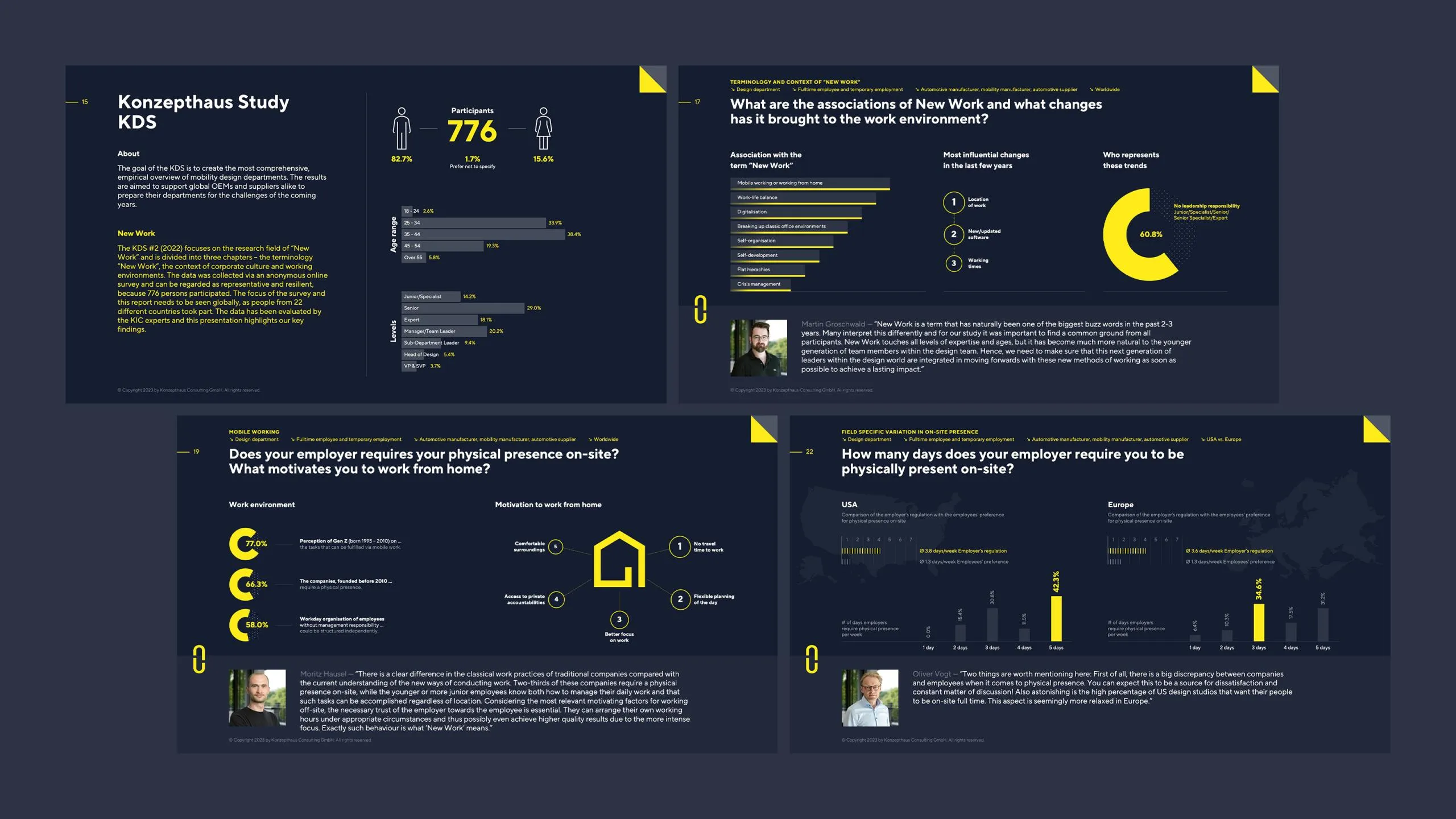
Strong colors, used in a striking and functional way, a modern typeface, and contemporary infographics. Konzepthaus communicates in a straightforward, direct, and personal manner.

The developed design principle is reflected in all visual elements of the design—e.g., in the icons. These are used not only functionally but also as eye-catching design elements.

The website was conceived and built entirely as a modular system to enable a high degree of flexibility and allow editors to manage it quickly and easily. This was 100% successful. The client’s enthusiasm for the work on the website made us smile and delighted us greatly.

Infographic featuring statistics and icons in yellow and dark blue, displaying business data and people
Tablet with pie charts from the Konzepthaus KDS Report
Presentation slides on a dark background with yellow accents
Black T-shirt with a white logo on the front and back